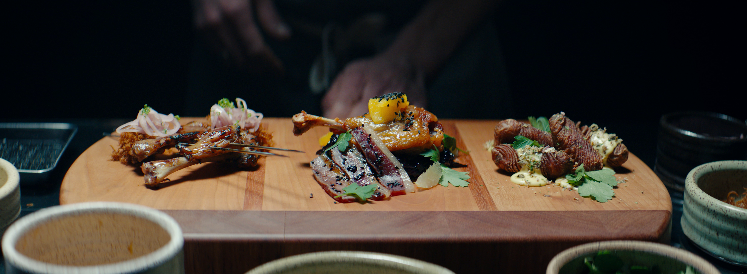
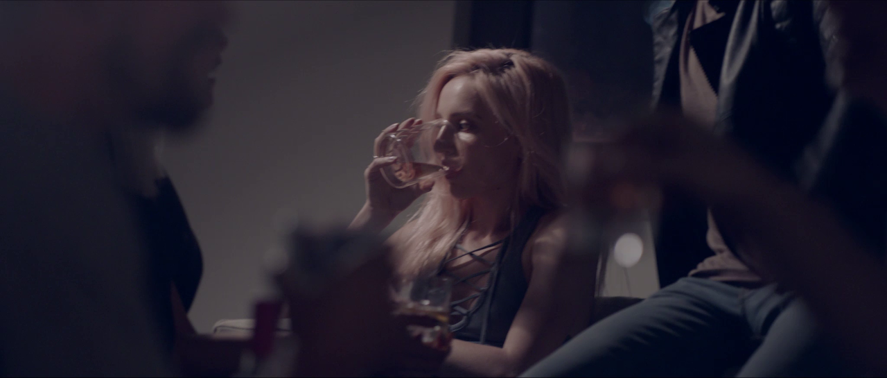
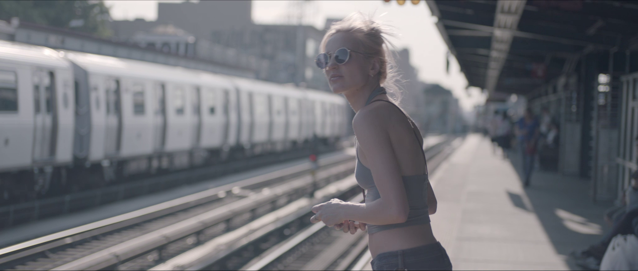
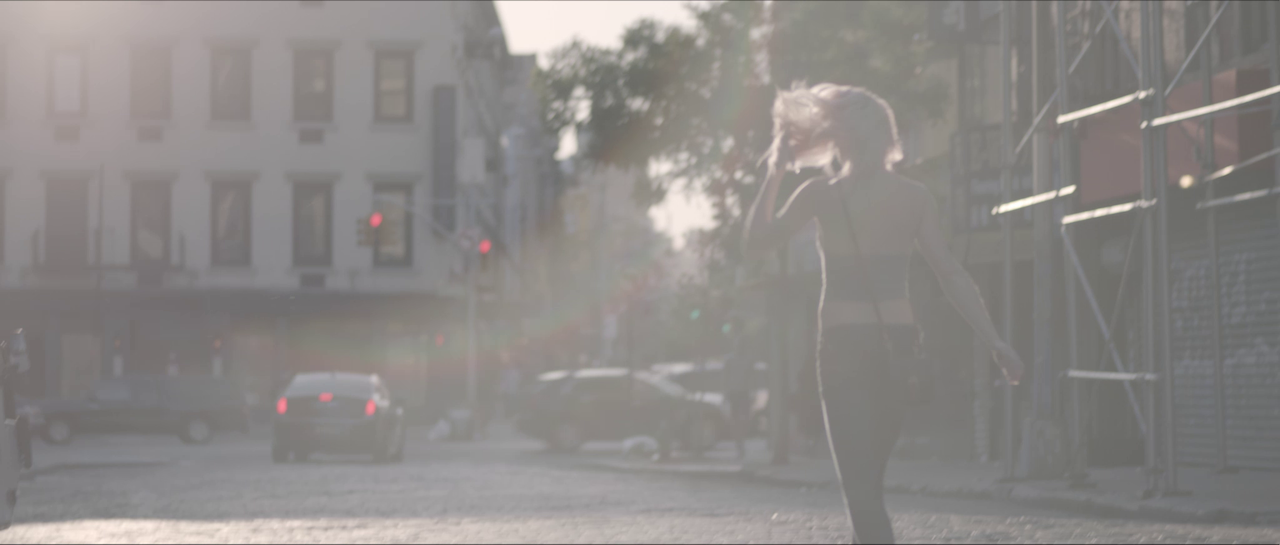
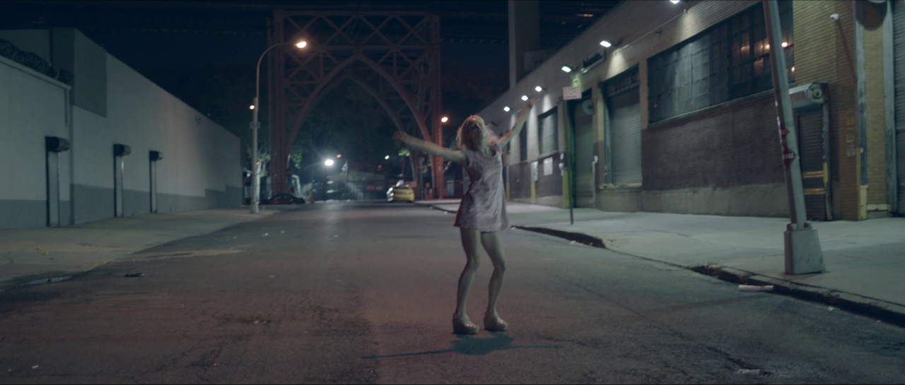
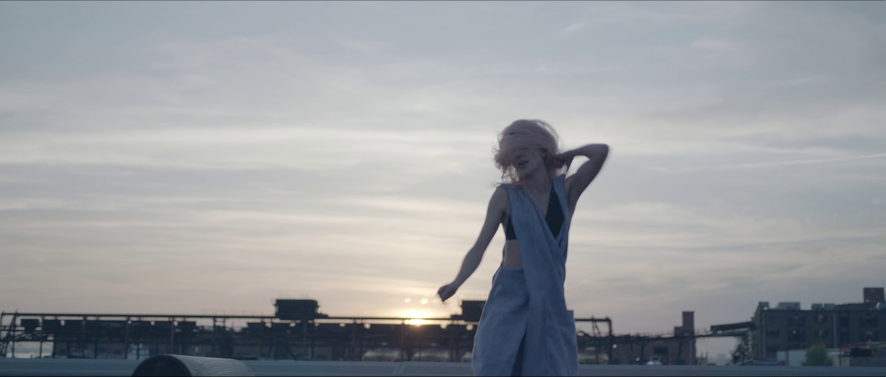
Elevating fitness advertising using vintage lenses, filters and slow-motion on Cityrow's GO campaign

I like to approach every shoot the same way - by asking myself “How can I make this better? More interesting? More captivating?”. It’s easy to become complacent in the world of commercials, especially when you start seeing the same creative over and over, so in this case, I was lucky to have a production company and collaborators that really wanted to push the boundaries and make this Cityrow spot something greater than the sum of its parts.

"Exercise is a natural escape. A way to leave the BS behind and go to a place that is entirely yours. CITYROW GO makes that easy with guided workouts that are available in your own space, on your own time. Through high-intensity, low-impact, total body workouts - it's as if an instructor was right there pushing you, taking you to the place you go when you sweat."

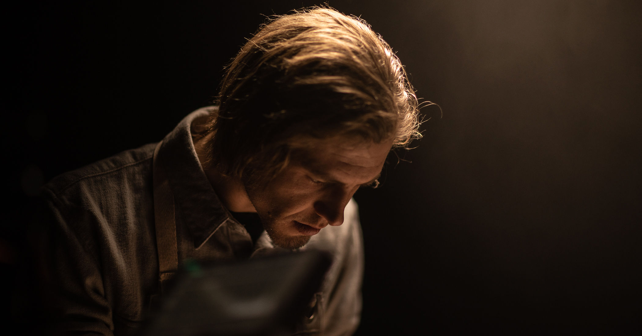
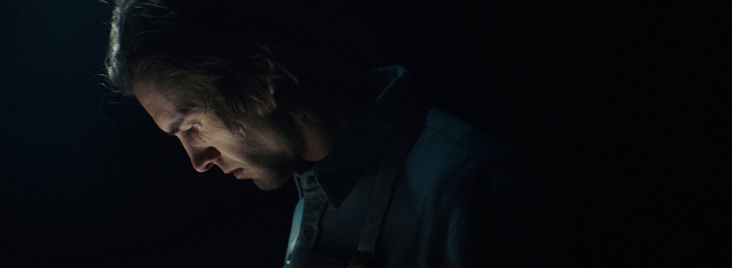
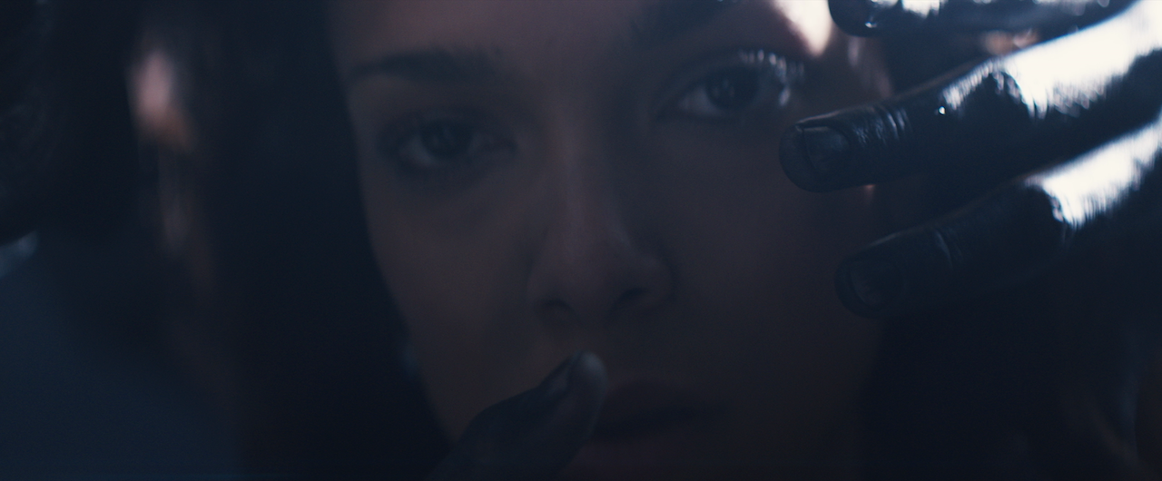
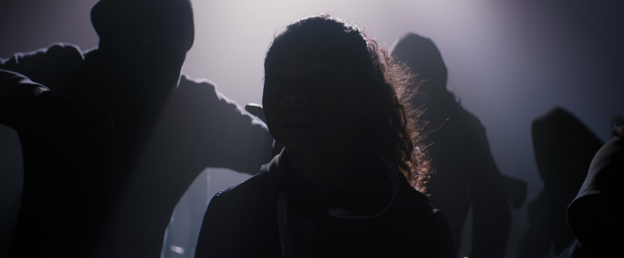
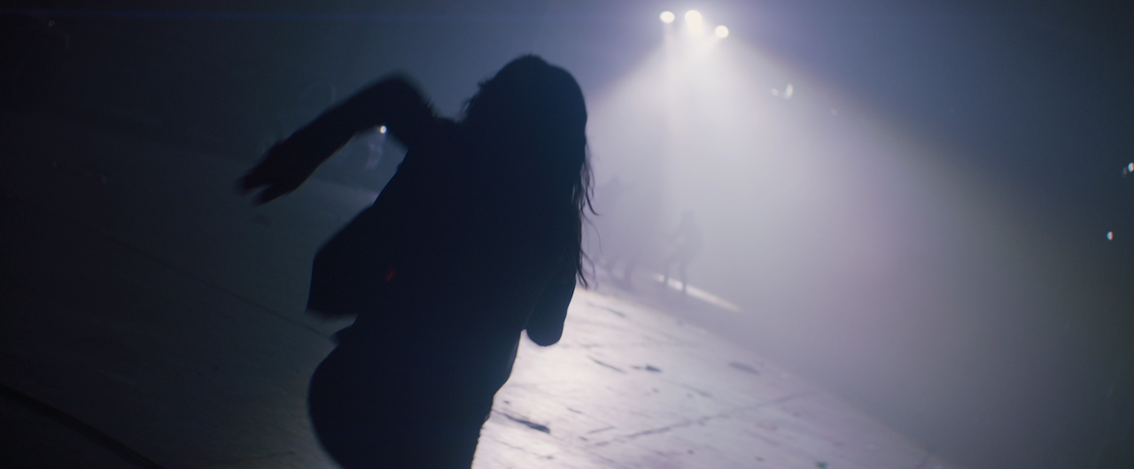
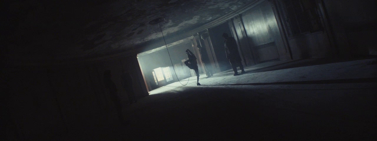
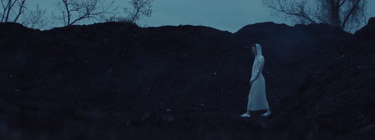
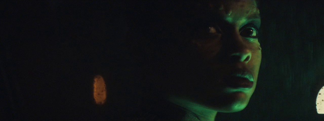
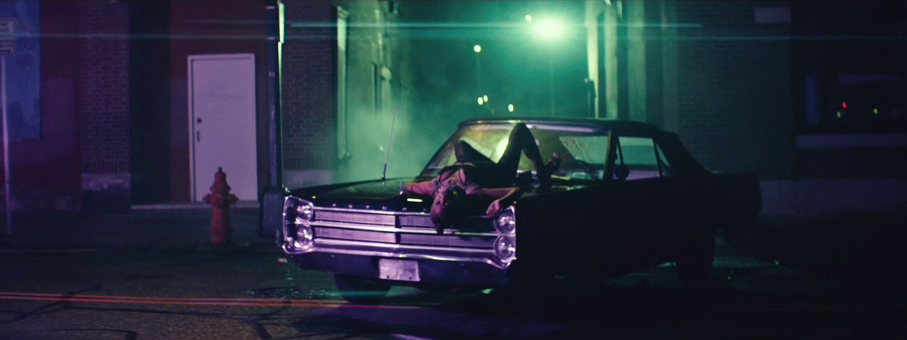
The concept is about transporting one's mind from their living room to the gym, and we wanted to create visuals that would not only support, but also elevate this concept. Exercise ads often times use soft light and low contrast imagery, so to make this piece stand out we wanted to embrace shadows, lens aberrations and high speed photography, while creating different looks for the various environments.

We shot on the ARRI Alexa Mini with Zeiss Superspeed lenses, mostly wide open so we could feel any flares and other aberrations that are typical of vintage lenses. Although it was a look, it wasn’t so aggressive that it might make the clients question whether or not it would work. The goal was to differentiate, not completely exit the space. 

The entire spot was handheld, and I used an Easyrig for the vast majority of it. Luckily, the camera and lens combo we had was very light, so I was able to go all day. Being handheld also allowed me to react quickly to the actors, who were all very fit and able to repeat workouts over and over. I really fed off their energy and I think that comes through in the camera work.

For our living room look, we had to create environments that felt similar in tone, but varied enough to look like several different homes. Since we shot these all in 10 hours in one brownstone in Brooklyn, we allowed the architecture of the upstairs and downstairs to separate our day sets, and we tented our third area for a night look. To boost the warmth and richness of skin tones, I wore a Tobacco 1 filter and white balanced to 3200K, which evened out the blue colors of daytime.

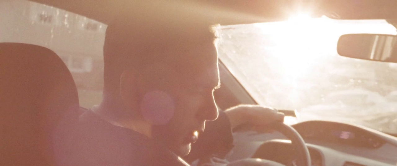
The daytime scene with our male hero was actually shot during a downpour, but thankfully we were able to soften it with the Superspeeds at T1.3 while lighting it to look like a sunny afternoon. Gaffer Greg Tango elaborates: "We opted to use the Digital Sputnik DS6. This unit gave us the punch of a flooded 4k while only pulling 840 watts making it location friendly. The other advantage of this unit was the ease of dialing in color temps. We ended up adding warmth into the scene for mood."

For our nighttime living room set, I wanted to feel something outside of the windows other than just the black of the tent, so we placed 2 DS6 units as far away from the windows as would fit. I gaff taped the lights so that it would feel like lit windows across the street. One of them even feels like a corner bodega, for that authentic Brooklyn feel.

For the gym look, we went in a much cooler direction to differentiate the two environments. We originally wanted a hard sunlight look, but unfortunately our location did not allow for units to be placed outside of the windows. We decided to get as close as we could with the windows, and do something more interesting inside.

"We needed to push a key through the windows of the studio, which were on the second floor with no ground access bellow. We went with rigging Lite Gear Lite Tiles to the windows for most control over color and intensity, and lit the rest of the scene with JoLeko 800s. One had a laser line gobo that panned across talent and the other was pushed into a painters tray filled with broken mirror pieces and water. The reflected mirror water bounce created subtle texture while the direct hard moving laser line provided something dynamic.” -Greg Tango

In addition, I suggested to director Winston Macdonald that we try and add a little something extra to boost the production value - 1000fps shots. Knowing that particles and slow motion are one of the best visual combos around, I thought the water rower would be a perfect candidate for this. Unfortunately, we didn’t have the budget for a Flex 4K and a tech, but I have thrown in a Phantom Miro on various shoots for some specialty shots. It works best when it is only used for macros and inserts, which is exactly what we did here. The shots of water, speed ramped in the edit, were an immediate hit.

This was one of my favorite commercial shoots to date, and it all started with the trust and collaboration from the folks over at Vagrants Co

As always, the conversation continues on Instagram (@dkruta). Please feel free to send me any questions or comments. I love chatting about cinematography and I’m always interested to hear your thoughts.

Capturing a Haunting in Progress: Behind the Scenes of a Promo Shoot for A&E's "Ghost Hunters"

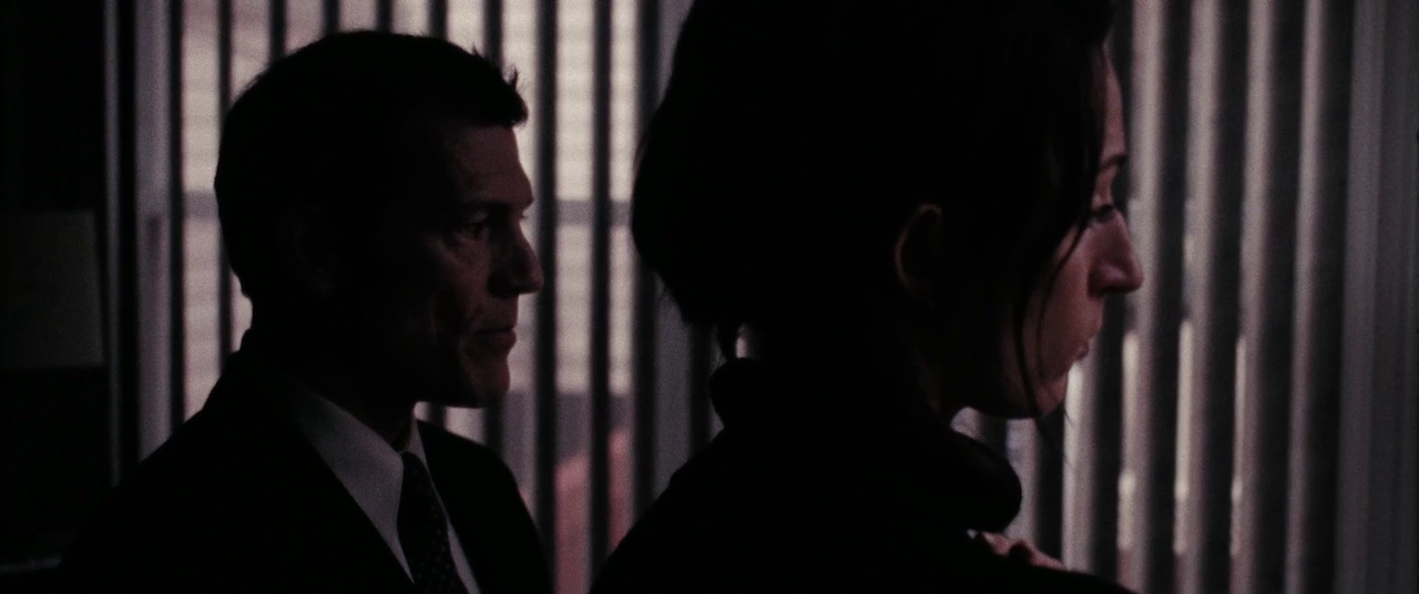
I love the challenge of executing something in a single shot. It requires extensive planning, communication, lots of rehearsals, creative choreography, and a little luck. Although this promo for Ghost Hunters ended up with cuts, the original idea and execution were all geared towards a single take which would show us around a house in the process of being actively haunted.
vlcsnap-2019-07-26-14h22m33s495.PNG

Our location was a historic mansion on Staten Island, the location of a 90s mob hit and a late-1800s suicide. By all accounts, it was actually haunted, but we had to go in and make it look like that and more, all in the span of a 30-second spot.

Screen Shot 2019-08-06 at 12.00.39 PM.png

I was lucky to have a highly communicative collaborator in director Evan Glaser, who walked me through his vision for the spot while listening to my and my team's creative ideas, and the limitations of the location. We started out with a rough walk-through, built up to photos of each room and space, and eventually mapped out the whole shot with an iPhone video. Using that as a base reference, Evan and the creative team then built the spot with speed ramps, cues written in, and voiceover, which would become our template on the shoot day.

So much of creating a single-shot sequence is about repetition. You walk it through over and over, and build on it each time. You find moments that could be sped up, others slowed down, areas that are “dead” and need some sort of action, where you can hide lights, what obstacles the operator has to avoid, etc.

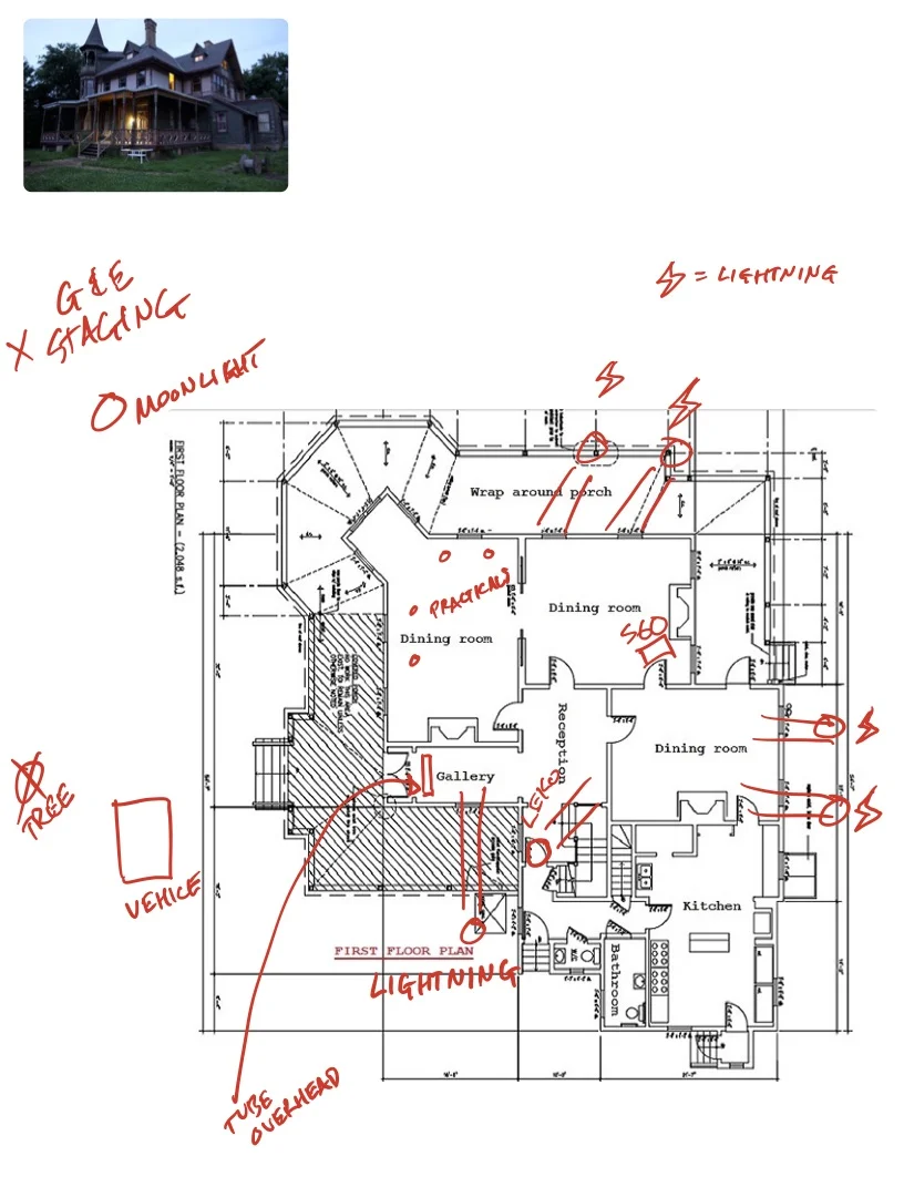
Once you arrive on the shoot day, it feels like time has stopped. We planned our day around the idea of shooting right before dusk, so that we could shoot until it was too dark. The goal was to have just a little blue in the sky so we could see our house at the end. We spent almost 6 hours lighting, running cables, coordinating “jump-scare” gags, and rehearsing the move. I will usually spend the time to come up with better looking plots, but due to the tight turnaround between the scout and shoot, I opted for photos and overheads with written notes to get my crew on the same page.
It felt like we weren’t getting anything done, despite the flurry of activity. But suddenly the sun hits the right spot in the sky, the lighting cues are all set, and the AD is anxious. So you start to roll, and very quickly, it all comes together beautifully.

Gaffer Billy Macartney used a DMX board to control all of the lights in the spot. From his control booth on the porch, he was able to cue light flickers, lightning effects, and make adjustments from take to take when something was too colorful or too bright.

This spot was lit with a K5600 Lighting Joker 1600 with an Octobank to create our moonlight from outside. As we progress through the house, we use an Arri Skypanel S60c to wrap the moon beams around the house and into the dining room, where a 1k Parcan on a doorway dolly creates our moving-headlights gag, casting a creepy shadow on the far wall. Astera Titan tubes fill out the next room and hallway for lightning strike effects.

An equally crucial contributor was Steadicam operator Tanner Carlson, who added his own flair to the move, finding moments that could be adjusted to help the overall flow of the spot. He also proved adept at avoiding obstacles in the tight hallway, and was able to navigate backwards down the front stairs and land on a perfect frame of the car pulling in every time.

Check out the final spot below:

As always, the conversation continues on Instagram (@dkruta). Please feel free to send me any questions or comments. I love chatting about cinematography and I’m always interested to hear your thoughts.


Some people settle, but not us: The making of a commercial, from start to finish

As a cinematographer, you’re usually only involved in the creative process immediately prior to, and during, production. Occasionally, if you’re lucky, you’ll also be brought in to work with a colorist on the final DI, which these days does not happen often. It almost never happens that you get to be involved in the entire process from start to finish, but as I have stressed before, filmmaking is a collaborative art, and having creative collaborators that you trust as much as they trust you, although rare, is truly an extraordinary thing.

Director Mike Pecci (@mikepecci) approached me at the very beginning of this project. Before he knew what the story would be, who would be cast as talent, or what products would be showcased, he called me up and told me that Dalstrong had given him a budget and to make something cool, and wanted my help. Mike and I have worked on an extensive list of projects together, and one of my favorite parts of collaborating with someone I trust is that ego is left at the door. If he asks me for creative suggestions, it doesn’t mean I’m trying to take his job. If he suggests a way to light or shoot something, it doesn’t mean he’s trying to take mine. This is entirely about coming out of this process with something that we are both incredibly proud of.

We started discussing ideas and one aspect we explored immediately was casting. The chef we had worked with previously on a different Dalstrong campaign had since moved out of state. Another chef that we both admire (and local to the Boston area) was so slammed running three restaurants that we would never have been able to schedule the shoot in a reasonable manner. But it just so happens that I had an incredibly talented chef in the family: my brother Philip, chef/owner of Brassica Kitchen in Jamaica Plain (@brassicakitchen).

The Talent

Chef Philip Kruta of Brassica kitchen shoots a food commercial with the Arri Alexa Mini and Cooke Anamorphic lenses

We called him up and he was immediately in to the idea. A former filmmaker himself, he was familiar with the process and excited about all the ways he could help. As we started talking about the ways we could portray his food and knife work, another exciting creative opportunity showed itself - his woodworking. Phil is an incredible woodworker, and built a lot of his restaurant by hand. The overarching elements of the story were there, but we needed to unite them in a way that would tell a story and portray the brand positively.

In the spirit of collaboration, we reached out to another person that I’ve had the pleasure of collaborating with numerous times: writer, director, and former (always?) creative, Patrick Biesemans (@patrickbiesemans). He didn’t hesitate to say yes, and within days had written the first pass at the voiceover, which would ultimately become our guideline for what we would capture on camera.

The Idea

DALSTRONG+VOICE+OVER.jpg

Patrick’s outline focused on the abuse our hands take from the daily rigors of working with wood and with food. It portrayed perfection as something born from abuse, hard work and diligence. It looked at taking rough, raw materials and turning them in to a thing of beauty.

I found many parallels between that and my own work with Mike. We spoke for hours over numerous phone calls about how to create the visuals for this spot, because we wanted to touch on all these aspects with the images you would see on screen. There had to be rough, chaotic, contrasty scenes, mixed with energy, refinement and beauty. We have shot extremely stylized spots in the past, as well as more subdued and polished ones, but this was an opportunity to show both what we could do, while holding true to ourselves as filmmakers.

The Execution

Having decided on building out three different worlds, with a single thread in the form of lighting cues to tie them all together. These would be the workshop, the restaurant, and the void, where our chef would be cutting, cooking and plating against a black background. We started by passing visual references back and forth, from which I could build out our lighting plots.

planning a film shoot camera references

Due to time and talent availability restraints, the location work had to stay minimal. We lit mostly with a set of Astera Titan tubes, supplemented with a Joker 400 and some canned haze. This lent itself well to the “real life” look of the locations, and allowed us to focus our efforts on the stage work. Gaffer Ruben Alves and his crew set up a box of 20x20 solids, a Skypanel S30 on a menace arm, and the Titans so that we could jump from one setup to another with ease.

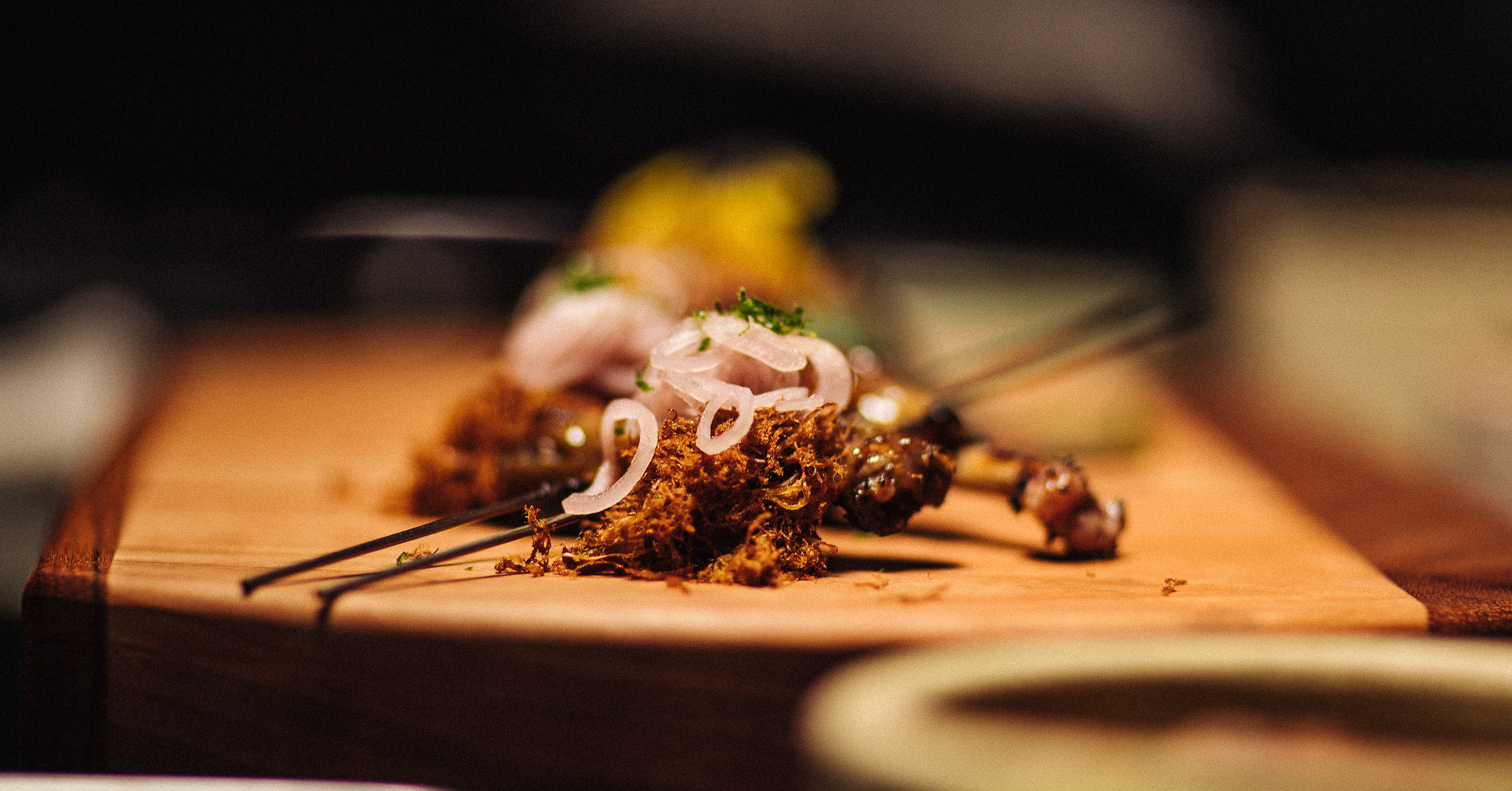
When lighting food, I like to use a large, soft source either from above or off to the side to mimic a window. Not only does the size of the source allow for it to wrap around the food and fill in the shadows, it also creates a reflection. A light glaze on the food emphasizes this, and these two qualities together make it look lively and appetizing. A lot of us in the field of cinematography love to use darkness and shadows, but this is an instance where softness and fill can work to your benefit.

We shot on the Alexa Mini with Cooke Anamorphic/i lenses, a departure from the Lomo Square Fronts that Mike and I usually shoot on together. The reasoning behind this was that we wanted to retain our style that usually involves anamorphic lenses and aberrations, but to bring some modern polish to the rest of the spot. The Cookes are a wonderful set of lenses that retain some of that vintage character, especially wide open, while being much sharper and mechanically forgiving than the Lomos.

Post Production

As the spot was being edited, Mike was inspired by the sound design and voiceover from the Avengers: Endgame trailer, and used that as a rough track to cut to. He sent me the first rough cut, and we agreed that we loved the simplicity of it.

Although Patrick had written a beautiful monologue to accompany the spot, we had to go back to the drawing board. This is where ego could have easily come in, but again, with great, trusted collaborators, there is nothing but a desire to create the best work we can. He agreed with where it was headed, and rewrote and reworked the voiceover until it became what you hear in the final spot.

We were lucky enough to have one more collaborator in the room (literally): Rob Bessette (@robsbessette), colorist at Finish Boston, who threw himself into the project with an enthusiasm that gave us the energy to finish the piece with a bang. We pulled a single marathon session and went through each frame, building a color palette that would evoke different emotions in each scene, while guiding your eye to the relevant parts of the frame and taking you through this journey of craftsmanship, passion and perfectionism.

Although I wasn’t able to work with him directly, the music by Code Elektro tied the whole piece together. Check him out on Instagram at @code_elektro.

As always, the conversation continues on my Instagram (@dkruta). Please feel free to send me any questions or comments. I love chatting about cinematography and I’m always interested to hear your thoughts.

Lighting on a budget, or Doing more with less

It’s 2019. We have all the Ks, incredibly sensitive sensors, cheap glass, and stabilizers available at any Best Buy. Fuji recently released the XT-3, with image quality and a codec that rivals the Arri Alexa. And it has never been cheaper and easier than it is now to rent a high-end camera package for pennies on the dollar. It’s a great time to be a DP. Or is it?

What if you can’t get the lights (or more importantly, the crew) to get that big-budget, professionally lit, high end image that you have in your head? You read that Roger Deakins used a row of 18ks to light up the desert at night, and now anything less than that is unacceptable. What do you do now?

Suck it up. This is the era of no more excuses. Low budget lighting IS possible, and I’ll tell you how. No, this is not some race-to-the-bottom how-to guide of how to get stuck in no-budget land. I’ll have plenty of posts in the future discussing large lighting setups. But for now, let’s talk about the best ways to light your image when you just don’t have the resources to go huge.

Location, location, location

This age-old mantra holds true to this day. How many times have you found yourself in some apartment building or set with 4 white walls, wondering why your frame looks terrible? No amount of lighting is going to make a bad location look great, and this is why you should always start with a great location.

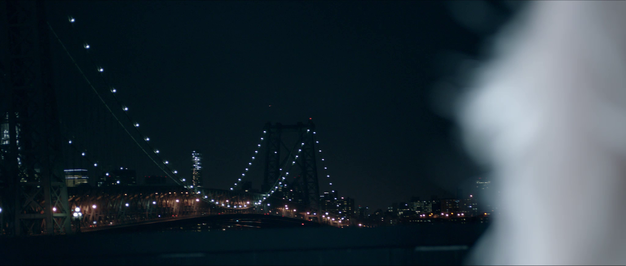
When you don’t have the money to rent a space with amazing architecture, beautiful windows, or built in lighting, you just need to get creative. If you’re in a city, there are plenty of beautiful locations accessible to the public, it’s just a matter of finding them. For the Sve “Paint a Picture” video, we had no choice but to find free locations, given that the budget was a grand total of $0. Living in New York City, the opportunities are everywhere. We shot on the subway, on a pier in Red Hook, in the East Village and in a friend’s apartment with a rooftop overlooking the Williamsburg Bridge.

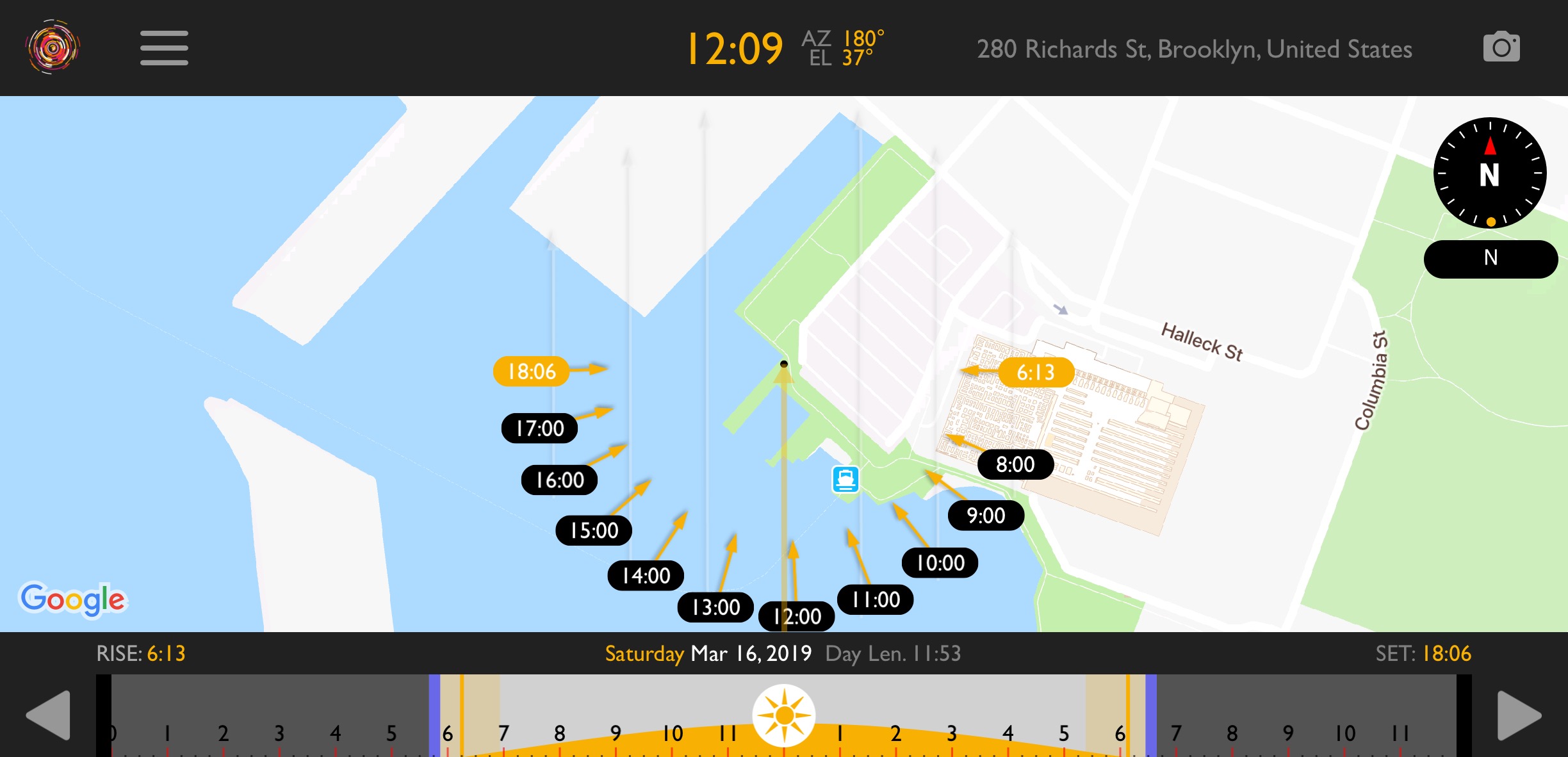
The key to using free locations to your advantage is to scout properly and schedule smartly. For daytime scenes, utilizing the sun to your advantage is a necessity. I use Helios Pro to track the path of the sun, and then I schedule the scene accordingly so that my subject is usually backlit, and that preferably the most important shots happen during golden hour. 

Use available light

Just because you’re shooting a movie doesn’t mean you have to use movie lights. Depending on the story, a naturalistic look might be the best approach. When director Mimi Jeffries approached me to shoot a short film about mental illness, I wasn’t discouraged by the lack of resources. Instead, we embraced a look that we called “shaped reality”, and using whatever lighting existed in the space already, we would modify it to suit our needs.

vlcsnap-2019-03-16-10h12m47s218.png

I worked closely with our two-man grip department in setting flags, hanging duvetyne, and otherwise sculpting light from the fixtures that were available to us. It didn’t always work perfectly, as you can see in this wide hallway shot where the duvetyne shadows are visible, but taken as a whole, the look reflected the grittiness of the story.

In two contrasting scenes, the boy’s aunt worries about our main character’s return and state of mind. For this, we added negative fill on the ceiling, as well as anywhere outside of frame, to create a dark sense of foreboding. On the other hand, for the escape to Disneyworld, we timed the drive so that the sun would pop in through the windows, creating a bright and warm look.

Adjust the creative

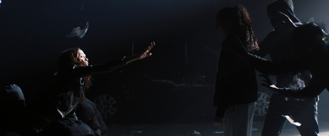
Just because you write a script starting with “EXT. NIGHT” doesn’t mean you can actually afford to do it. Night exteriors are notoriously expensive, slow moving, and generally an unpleasant experience without full control of everything. So when director Patrick Biesemans sent me the treatment for the “For Shelley” music video, I couldn’t help but feel nervous about how we would pull it off.

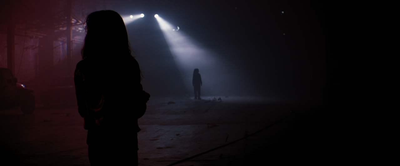
When working with a small budget, it’s important to trust your creative partners, and for them to trust you as well. When I make creative suggestions, it’s never because I am trying to impose my will or vision on the director - it is because I understand the limitations from a different perspective, and I want to make the final spot as good as possible. I suggested to Patrick to shoot in a warehouse space that we could dress with crew members’ cars to appear as if it was shot in a back alley at night. It fit the “nightmare world” aesthetic better, creating a surreal space for our chase scene to take place.

Patrick’s treatment called for vertical beams of light illuminating the girl and her mother, but after scouting the location we learned that they had a scissor lift available, and I suggested using moving lights to add a dynamic element to the video given the static nature of everything else. We lit everything with 3 JoLeko 800s with 10-degree barrels, and a single Skypanel to give us a dash of color.

What could have been a massive and expensive endeavor outside on a street became a much more efficient, and in my opinion, visually impressive piece that fit the story better. We were able to control the space, use atmosphere without needing a huge SFX crew, and light with a small G&E package, without being constrained by sunset and sunrise or needing to shoot overnight.

Use atmosphere

The single, most effective, and still my favorite way to light on a budget is to use atmosphere. Nothing gets you more bang for your buck, and I would rather cut every light on the truck before I get rid of the hazer. Haze adds volume and depth to the image. It adds fill via ambience instead of making shadows look unnatural. 

There are also other types of atmosphere that I love to use. Finely-chopped down feathers create a look of floating pollen which reacts beautifully to character’s movements or to fans and leaf-blowers. Wind creates an environmental element that can either mimic a character’s state of mind, or exaggerate their struggle. A bag of bio-snow, which depending on the size you purchase, can either look like snowfall or act like dust. A $100 bag will last you for days.

For the “Caught Up” video, the creative requirements lined up nicely with using atmosphere. We usually had a hazer running somewhere, even in exterior shots. The smoke in the alleyway is coming from a hazer hidden behind the car. What’s the motivation? Who cares, it looks great, and I bet you didn’t even notice before I pointed it out.

Director Floyd Russ even brought canned haze along, and we used it in the car for the scenes with our alien villain driving around, looking for her next victim. I still can’t believe it was mostly lit with a cheap Chauvet DJ light and a $20 RGB LED strip from Amazon. We did have a Skypanel and a Joker 400 for a couple of shots, but they didn’t play too often.

Every film can benefit from these rules: find great locations, use available light smartly, be flexible in your creative requirements, and utilize atmosphere. Whether you have $100 or $100 million, you can always fall back on these foundations to create beautiful images. Just remember that the number one purpose of a great image is to tell a great story.

As always, the conversation continues on my Instagram (@dkruta). Please feel free to send me any questions or comments. I love chatting about cinematography and I’m always interested to hear your thoughts.