Elevating fitness advertising using vintage lenses, filters and slow-motion on Cityrow's GO campaign

I like to approach every shoot the same way - by asking myself “How can I make this better? More interesting? More captivating?”. It’s easy to become complacent in the world of commercials, especially when you start seeing the same creative over and over, so in this case, I was lucky to have a production company and collaborators that really wanted to push the boundaries and make this Cityrow spot something greater than the sum of its parts.

"Exercise is a natural escape. A way to leave the BS behind and go to a place that is entirely yours. CITYROW GO makes that easy with guided workouts that are available in your own space, on your own time. Through high-intensity, low-impact, total body workouts - it's as if an instructor was right there pushing you, taking you to the place you go when you sweat."

The concept is about transporting one's mind from their living room to the gym, and we wanted to create visuals that would not only support, but also elevate this concept. Exercise ads often times use soft light and low contrast imagery, so to make this piece stand out we wanted to embrace shadows, lens aberrations and high speed photography, while creating different looks for the various environments.

We shot on the ARRI Alexa Mini with Zeiss Superspeed lenses, mostly wide open so we could feel any flares and other aberrations that are typical of vintage lenses. Although it was a look, it wasn’t so aggressive that it might make the clients question whether or not it would work. The goal was to differentiate, not completely exit the space. 

The entire spot was handheld, and I used an Easyrig for the vast majority of it. Luckily, the camera and lens combo we had was very light, so I was able to go all day. Being handheld also allowed me to react quickly to the actors, who were all very fit and able to repeat workouts over and over. I really fed off their energy and I think that comes through in the camera work.

For our living room look, we had to create environments that felt similar in tone, but varied enough to look like several different homes. Since we shot these all in 10 hours in one brownstone in Brooklyn, we allowed the architecture of the upstairs and downstairs to separate our day sets, and we tented our third area for a night look. To boost the warmth and richness of skin tones, I wore a Tobacco 1 filter and white balanced to 3200K, which evened out the blue colors of daytime.

The daytime scene with our male hero was actually shot during a downpour, but thankfully we were able to soften it with the Superspeeds at T1.3 while lighting it to look like a sunny afternoon. Gaffer Greg Tango elaborates: "We opted to use the Digital Sputnik DS6. This unit gave us the punch of a flooded 4k while only pulling 840 watts making it location friendly. The other advantage of this unit was the ease of dialing in color temps. We ended up adding warmth into the scene for mood."

For our nighttime living room set, I wanted to feel something outside of the windows other than just the black of the tent, so we placed 2 DS6 units as far away from the windows as would fit. I gaff taped the lights so that it would feel like lit windows across the street. One of them even feels like a corner bodega, for that authentic Brooklyn feel.

For the gym look, we went in a much cooler direction to differentiate the two environments. We originally wanted a hard sunlight look, but unfortunately our location did not allow for units to be placed outside of the windows. We decided to get as close as we could with the windows, and do something more interesting inside.

"We needed to push a key through the windows of the studio, which were on the second floor with no ground access bellow. We went with rigging Lite Gear Lite Tiles to the windows for most control over color and intensity, and lit the rest of the scene with JoLeko 800s. One had a laser line gobo that panned across talent and the other was pushed into a painters tray filled with broken mirror pieces and water. The reflected mirror water bounce created subtle texture while the direct hard moving laser line provided something dynamic.” -Greg Tango

In addition, I suggested to director Winston Macdonald that we try and add a little something extra to boost the production value - 1000fps shots. Knowing that particles and slow motion are one of the best visual combos around, I thought the water rower would be a perfect candidate for this. Unfortunately, we didn’t have the budget for a Flex 4K and a tech, but I have thrown in a Phantom Miro on various shoots for some specialty shots. It works best when it is only used for macros and inserts, which is exactly what we did here. The shots of water, speed ramped in the edit, were an immediate hit.

This was one of my favorite commercial shoots to date, and it all started with the trust and collaboration from the folks over at Vagrants Co

As always, the conversation continues on Instagram (@dkruta). Please feel free to send me any questions or comments. I love chatting about cinematography and I’m always interested to hear your thoughts.

Capturing a Haunting in Progress: Behind the Scenes of a Promo Shoot for A&E's "Ghost Hunters"

I love the challenge of executing something in a single shot. It requires extensive planning, communication, lots of rehearsals, creative choreography, and a little luck. Although this promo for Ghost Hunters ended up with cuts, the original idea and execution were all geared towards a single take which would show us around a house in the process of being actively haunted.

vlcsnap-2019-07-26-14h22m33s495.PNG

Our location was a historic mansion on Staten Island, the location of a 90s mob hit and a late-1800s suicide. By all accounts, it was actually haunted, but we had to go in and make it look like that and more, all in the span of a 30-second spot.

Screen Shot 2019-08-06 at 12.00.39 PM.png

I was lucky to have a highly communicative collaborator in director Evan Glaser, who walked me through his vision for the spot while listening to my and my team's creative ideas, and the limitations of the location. We started out with a rough walk-through, built up to photos of each room and space, and eventually mapped out the whole shot with an iPhone video. Using that as a base reference, Evan and the creative team then built the spot with speed ramps, cues written in, and voiceover, which would become our template on the shoot day.

So much of creating a single-shot sequence is about repetition. You walk it through over and over, and build on it each time. You find moments that could be sped up, others slowed down, areas that are “dead” and need some sort of action, where you can hide lights, what obstacles the operator has to avoid, etc.

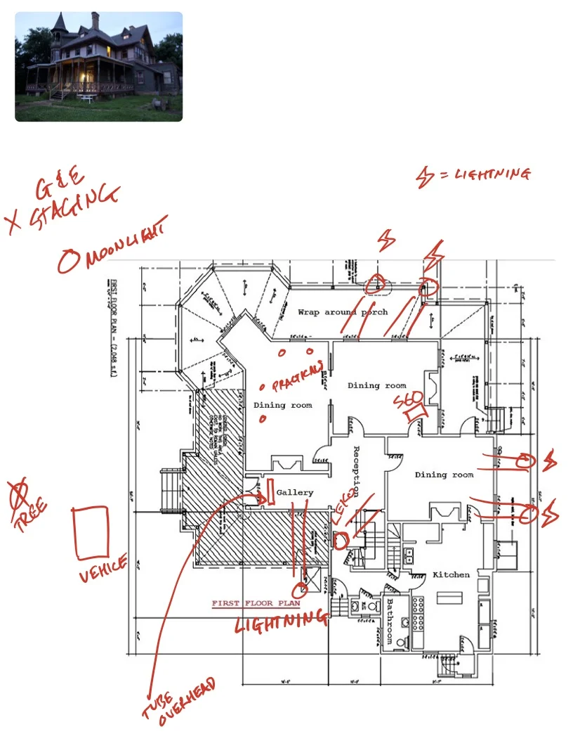
Once you arrive on the shoot day, it feels like time has stopped. We planned our day around the idea of shooting right before dusk, so that we could shoot until it was too dark. The goal was to have just a little blue in the sky so we could see our house at the end. We spent almost 6 hours lighting, running cables, coordinating “jump-scare” gags, and rehearsing the move. I will usually spend the time to come up with better looking plots, but due to the tight turnaround between the scout and shoot, I opted for photos and overheads with written notes to get my crew on the same page.

It felt like we weren’t getting anything done, despite the flurry of activity. But suddenly the sun hits the right spot in the sky, the lighting cues are all set, and the AD is anxious. So you start to roll, and very quickly, it all comes together beautifully.

Gaffer Billy Macartney used a DMX board to control all of the lights in the spot. From his control booth on the porch, he was able to cue light flickers, lightning effects, and make adjustments from take to take when something was too colorful or too bright.

This spot was lit with a K5600 Lighting Joker 1600 with an Octobank to create our moonlight from outside. As we progress through the house, we use an Arri Skypanel S60c to wrap the moon beams around the house and into the dining room, where a 1k Parcan on a doorway dolly creates our moving-headlights gag, casting a creepy shadow on the far wall. Astera Titan tubes fill out the next room and hallway for lightning strike effects.

An equally crucial contributor was Steadicam operator Tanner Carlson, who added his own flair to the move, finding moments that could be adjusted to help the overall flow of the spot. He also proved adept at avoiding obstacles in the tight hallway, and was able to navigate backwards down the front stairs and land on a perfect frame of the car pulling in every time.

Check out the final spot below:

As always, the conversation continues on Instagram (@dkruta). Please feel free to send me any questions or comments. I love chatting about cinematography and I’m always interested to hear your thoughts.