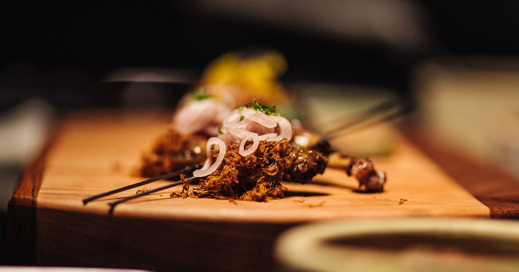
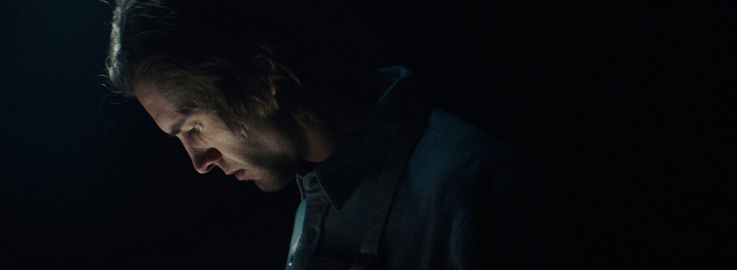
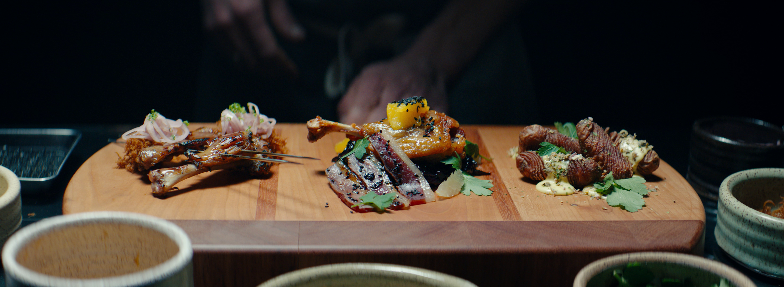
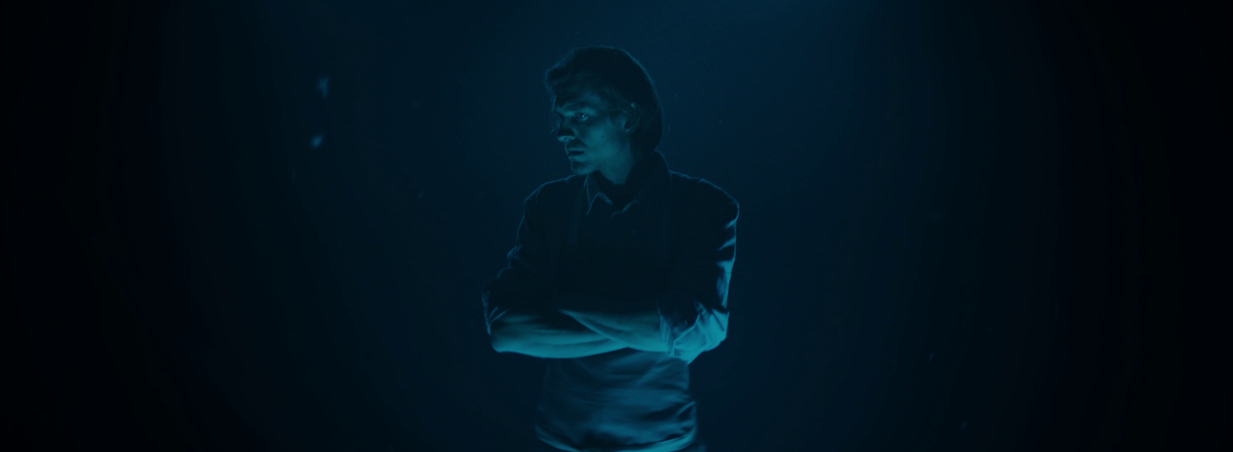
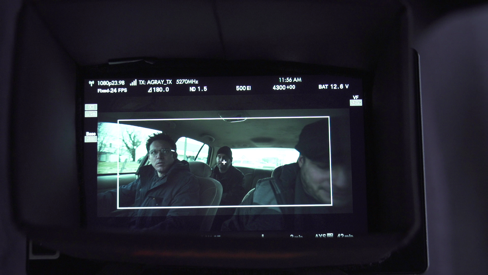
Some people settle, but not us: The making of a commercial, from start to finish

As a cinematographer, you’re usually only involved in the creative process immediately prior to, and during, production. Occasionally, if you’re lucky, you’ll also be brought in to work with a colorist on the final DI, which these days does not happen often. It almost never happens that you get to be involved in the entire process from start to finish, but as I have stressed before, filmmaking is a collaborative art, and having creative collaborators that you trust as much as they trust you, although rare, is truly an extraordinary thing.

Director Mike Pecci (@mikepecci) approached me at the very beginning of this project. Before he knew what the story would be, who would be cast as talent, or what products would be showcased, he called me up and told me that Dalstrong had given him a budget and to make something cool, and wanted my help. Mike and I have worked on an extensive list of projects together, and one of my favorite parts of collaborating with someone I trust is that ego is left at the door. If he asks me for creative suggestions, it doesn’t mean I’m trying to take his job. If he suggests a way to light or shoot something, it doesn’t mean he’s trying to take mine. This is entirely about coming out of this process with something that we are both incredibly proud of.

We started discussing ideas and one aspect we explored immediately was casting. The chef we had worked with previously on a different Dalstrong campaign had since moved out of state. Another chef that we both admire (and local to the Boston area) was so slammed running three restaurants that we would never have been able to schedule the shoot in a reasonable manner. But it just so happens that I had an incredibly talented chef in the family: my brother Philip, chef/owner of Brassica Kitchen in Jamaica Plain (@brassicakitchen).

The Talent

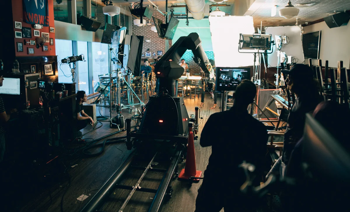
Chef Philip Kruta of Brassica kitchen shoots a food commercial with the Arri Alexa Mini and Cooke Anamorphic lenses

We called him up and he was immediately in to the idea. A former filmmaker himself, he was familiar with the process and excited about all the ways he could help. As we started talking about the ways we could portray his food and knife work, another exciting creative opportunity showed itself - his woodworking. Phil is an incredible woodworker, and built a lot of his restaurant by hand. The overarching elements of the story were there, but we needed to unite them in a way that would tell a story and portray the brand positively.

In the spirit of collaboration, we reached out to another person that I’ve had the pleasure of collaborating with numerous times: writer, director, and former (always?) creative, Patrick Biesemans (@patrickbiesemans). He didn’t hesitate to say yes, and within days had written the first pass at the voiceover, which would ultimately become our guideline for what we would capture on camera.

The Idea

DALSTRONG+VOICE+OVER.jpg

Patrick’s outline focused on the abuse our hands take from the daily rigors of working with wood and with food. It portrayed perfection as something born from abuse, hard work and diligence. It looked at taking rough, raw materials and turning them in to a thing of beauty.

I found many parallels between that and my own work with Mike. We spoke for hours over numerous phone calls about how to create the visuals for this spot, because we wanted to touch on all these aspects with the images you would see on screen. There had to be rough, chaotic, contrasty scenes, mixed with energy, refinement and beauty. We have shot extremely stylized spots in the past, as well as more subdued and polished ones, but this was an opportunity to show both what we could do, while holding true to ourselves as filmmakers.

The Execution

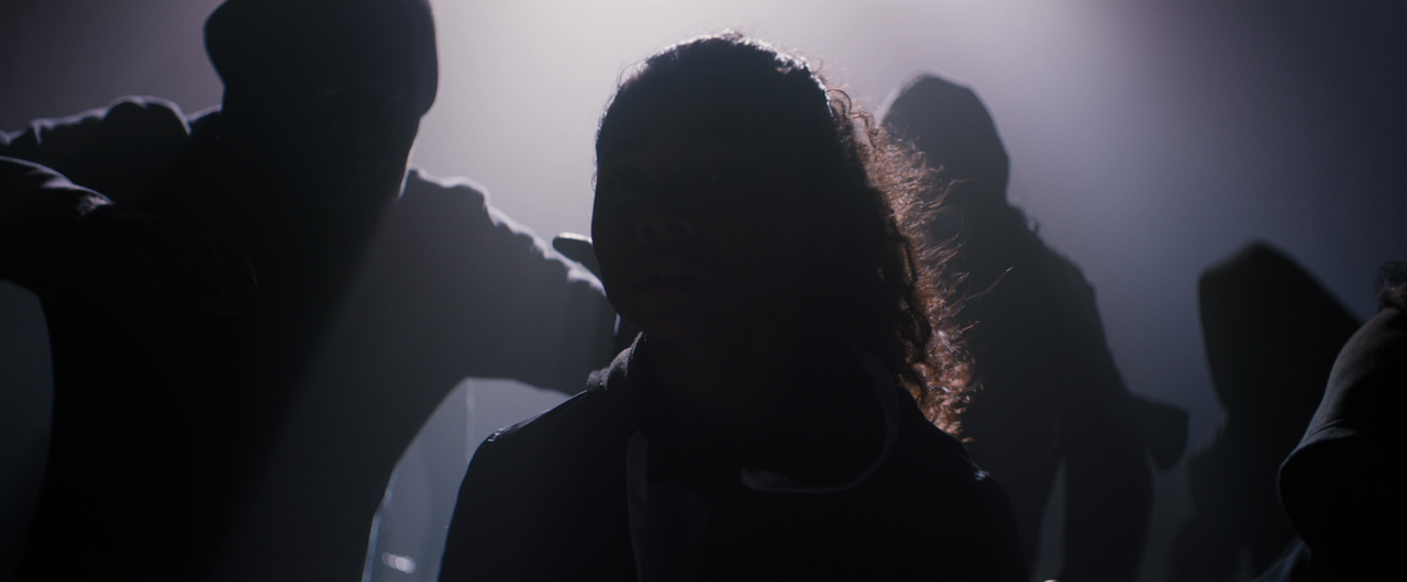
Having decided on building out three different worlds, with a single thread in the form of lighting cues to tie them all together. These would be the workshop, the restaurant, and the void, where our chef would be cutting, cooking and plating against a black background. We started by passing visual references back and forth, from which I could build out our lighting plots.

planning a film shoot camera references

Due to time and talent availability restraints, the location work had to stay minimal. We lit mostly with a set of Astera Titan tubes, supplemented with a Joker 400 and some canned haze. This lent itself well to the “real life” look of the locations, and allowed us to focus our efforts on the stage work. Gaffer Ruben Alves and his crew set up a box of 20x20 solids, a Skypanel S30 on a menace arm, and the Titans so that we could jump from one setup to another with ease.

When lighting food, I like to use a large, soft source either from above or off to the side to mimic a window. Not only does the size of the source allow for it to wrap around the food and fill in the shadows, it also creates a reflection. A light glaze on the food emphasizes this, and these two qualities together make it look lively and appetizing. A lot of us in the field of cinematography love to use darkness and shadows, but this is an instance where softness and fill can work to your benefit.

We shot on the Alexa Mini with Cooke Anamorphic/i lenses, a departure from the Lomo Square Fronts that Mike and I usually shoot on together. The reasoning behind this was that we wanted to retain our style that usually involves anamorphic lenses and aberrations, but to bring some modern polish to the rest of the spot. The Cookes are a wonderful set of lenses that retain some of that vintage character, especially wide open, while being much sharper and mechanically forgiving than the Lomos.

Post Production

As the spot was being edited, Mike was inspired by the sound design and voiceover from the Avengers: Endgame trailer, and used that as a rough track to cut to. He sent me the first rough cut, and we agreed that we loved the simplicity of it.

Although Patrick had written a beautiful monologue to accompany the spot, we had to go back to the drawing board. This is where ego could have easily come in, but again, with great, trusted collaborators, there is nothing but a desire to create the best work we can. He agreed with where it was headed, and rewrote and reworked the voiceover until it became what you hear in the final spot.

We were lucky enough to have one more collaborator in the room (literally): Rob Bessette (@robsbessette), colorist at Finish Boston, who threw himself into the project with an enthusiasm that gave us the energy to finish the piece with a bang. We pulled a single marathon session and went through each frame, building a color palette that would evoke different emotions in each scene, while guiding your eye to the relevant parts of the frame and taking you through this journey of craftsmanship, passion and perfectionism.

Although I wasn’t able to work with him directly, the music by Code Elektro tied the whole piece together. Check him out on Instagram at @code_elektro.

As always, the conversation continues on my Instagram (@dkruta). Please feel free to send me any questions or comments. I love chatting about cinematography and I’m always interested to hear your thoughts.

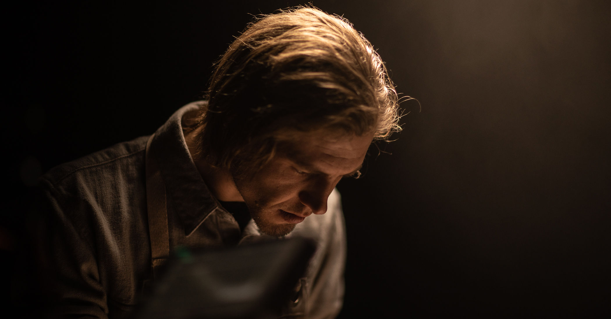
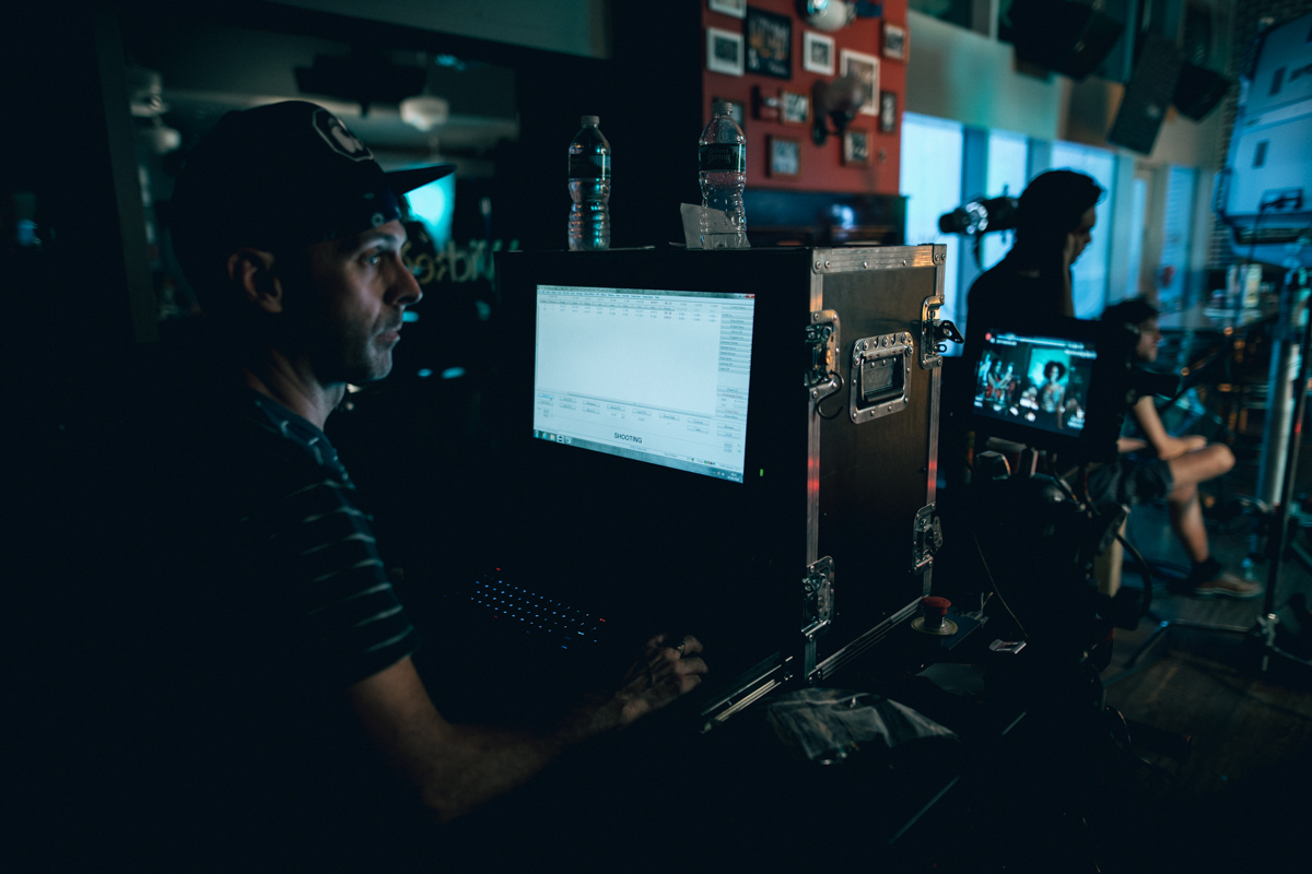
Shooting slow motion with a robot and a Phantom (camera)

Shooting a commercial with the Motion Control Bolt system behind the scenes

There’s nothing I love more about my job than being given a real challenge. Most jobs have some kind of problem you have to solve, while others are very straightforward (how many interviews could you light in your sleep?). But once in a while, they push you way out of your comfort zone in the most unexpected ways. These are my favorite type of jobs. They might not be the sexy, moody films that we all love to brag about on Instagram, but I have a blast trying to solve problems, make the product look good, and above all else, make the client happy. Shooting commercials is often less about the art and craft of cinematography, but rather about delivering a product that the client asked for. But what if you can merge all of these things, maybe learn something new along the way, and on top of that have a great time with your team? Now that’s the type of work I live for.

Brian Neaman directs a commercial with the bolt motion control slow motion system phantom high speed

Working with Yonder Content and director Brian Neaman, we were tasked with delivering a series of comedic spots for the New Jersey Lotto. Sounds like a typical, unmemorable job, right? Not if you’re shooting with a robotic arm capable of shooting motion-control at high speed, all while precisely choreographing a room full of actors that had to hit exact cues during a shot that lasted less than 5 seconds in real time.

First off - the agency boards. When you’re shooting a commercial, usually before even the director or production company is hired, the agency and the client put together rough storyboards of what will be delivered. It’s then up to the director and production company to execute them. This is what we were given and asked to shoot.

New Jersey Lottery Board.jpg
Bolt High Speed Cinebot

Working with the Bolt

The Bolt is a repurposed robotic arm that is typically used in automobile manufacturing, but has been modified to hold and move a camera at high speed with frame-accurate precision. It weighs a thousand pounds, requires 42 amps at 400 volts, and can move 6 feet per second. It’s absolutely terrifying and one of the coolest tools I have ever used.

It requires a 3-man crew to unload, set up and tweak. Each camera position is mapped out and programmed in to the software, and the move is built between the key frames. This is a time-consuming process, and it’s not uncommon for a single shot to take up the majority of a shoot day. However, the results are entirely worth it.

Bolt High Speed Cinebot

Blocking

Our prep process included a significant amount of blocking. Since the ad plays out in one take, we had to be precise in mapping out all of the action. In addition, due to the significant risk of injury from the Bolt arm, actors had to be on their marks at all times, and could not move until given specific instructions. When you hear something described as having a lot of “moving parts”, this was literally the embodiment of that definition.

It’s amazing seeing everything come together. Below, you can watch everything in action.

Lighting for the Phantom

This spot called for slow motion in the realm of 400-1000 frames per second, so we shot on the Phantom Flex 4K and ARRI Master Primes, courtesy of Abel Cine in New York. Personally, I love the Master Primes - not only do they have a great look with beautiful skin tones and subtle focus falloff, but they are also tack sharp wide open. Knowing that I have the ability to open up a stop or two further than most other lenses without losing that sharpness is usually a must with Phantom shoots. Luckily the Bolt accurately controls the focus as well, so my camera assistant had a pretty relaxed day.

Gaffer Greg Tango had this to say about his experience lighting for high speed: "The challenge of slow motion is having enough punch from units while not flickering. We utilized an ARRI Skypanel 360 and a couple S60s for keys. These units all have a high speed mode that allow filming up to 1000fps. The key is never truly the issue when shooting high speed (just need enough punch), it’s trying to fill the backgrounds with the right intensity and shape of light. Our first choice was to use Quasar Crossfades but we found those to flicker at the higher frame rates. Instead we ended up using a mixture of ARRI L10Cs and Lite Mats to get the right background levels."

Creatively speaking, both the client and director were open to playing around with more colors and shape to the lighting than might be typical of a spot like this. The teal in the background really helped sell a nighttime look, even though we shot during the day and couldn’t use any practicals. Coincidentally, the color ended up being on-brand as well. I’m very happy with the look of this spot.

I’d like to extend a big thank you to Yonder and NJ Lotto for having me, and to my amazing crew that made my job easy. Check out the finished spot below!

As always, the conversation continues on my Instagram (@dkruta). Please feel free to send me any questions or comments. I love chatting about cinematography and I’m always interested to hear your thoughts.

Lighting on a budget, or Doing more with less

It’s 2019. We have all the Ks, incredibly sensitive sensors, cheap glass, and stabilizers available at any Best Buy. Fuji recently released the XT-3, with image quality and a codec that rivals the Arri Alexa. And it has never been cheaper and easier than it is now to rent a high-end camera package for pennies on the dollar. It’s a great time to be a DP. Or is it?

What if you can’t get the lights (or more importantly, the crew) to get that big-budget, professionally lit, high end image that you have in your head? You read that Roger Deakins used a row of 18ks to light up the desert at night, and now anything less than that is unacceptable. What do you do now?

Suck it up. This is the era of no more excuses. Low budget lighting IS possible, and I’ll tell you how. No, this is not some race-to-the-bottom how-to guide of how to get stuck in no-budget land. I’ll have plenty of posts in the future discussing large lighting setups. But for now, let’s talk about the best ways to light your image when you just don’t have the resources to go huge.

Location, location, location

This age-old mantra holds true to this day. How many times have you found yourself in some apartment building or set with 4 white walls, wondering why your frame looks terrible? No amount of lighting is going to make a bad location look great, and this is why you should always start with a great location.

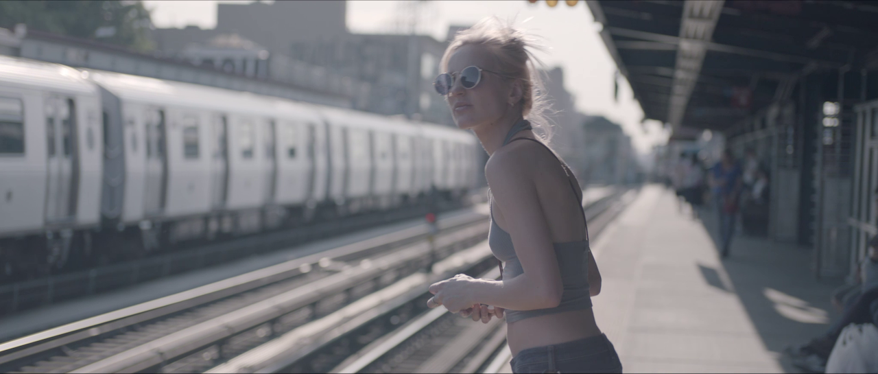
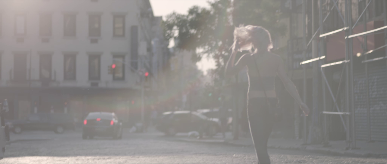
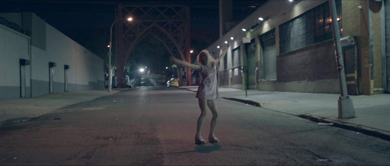
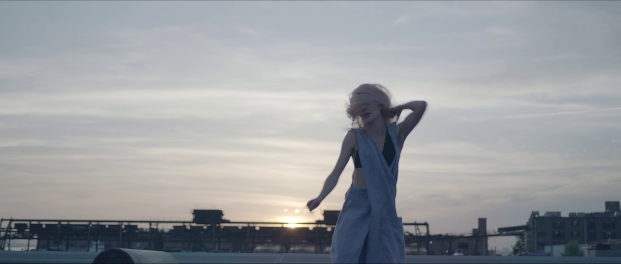
When you don’t have the money to rent a space with amazing architecture, beautiful windows, or built in lighting, you just need to get creative. If you’re in a city, there are plenty of beautiful locations accessible to the public, it’s just a matter of finding them. For the Sve “Paint a Picture” video, we had no choice but to find free locations, given that the budget was a grand total of $0. Living in New York City, the opportunities are everywhere. We shot on the subway, on a pier in Red Hook, in the East Village and in a friend’s apartment with a rooftop overlooking the Williamsburg Bridge.

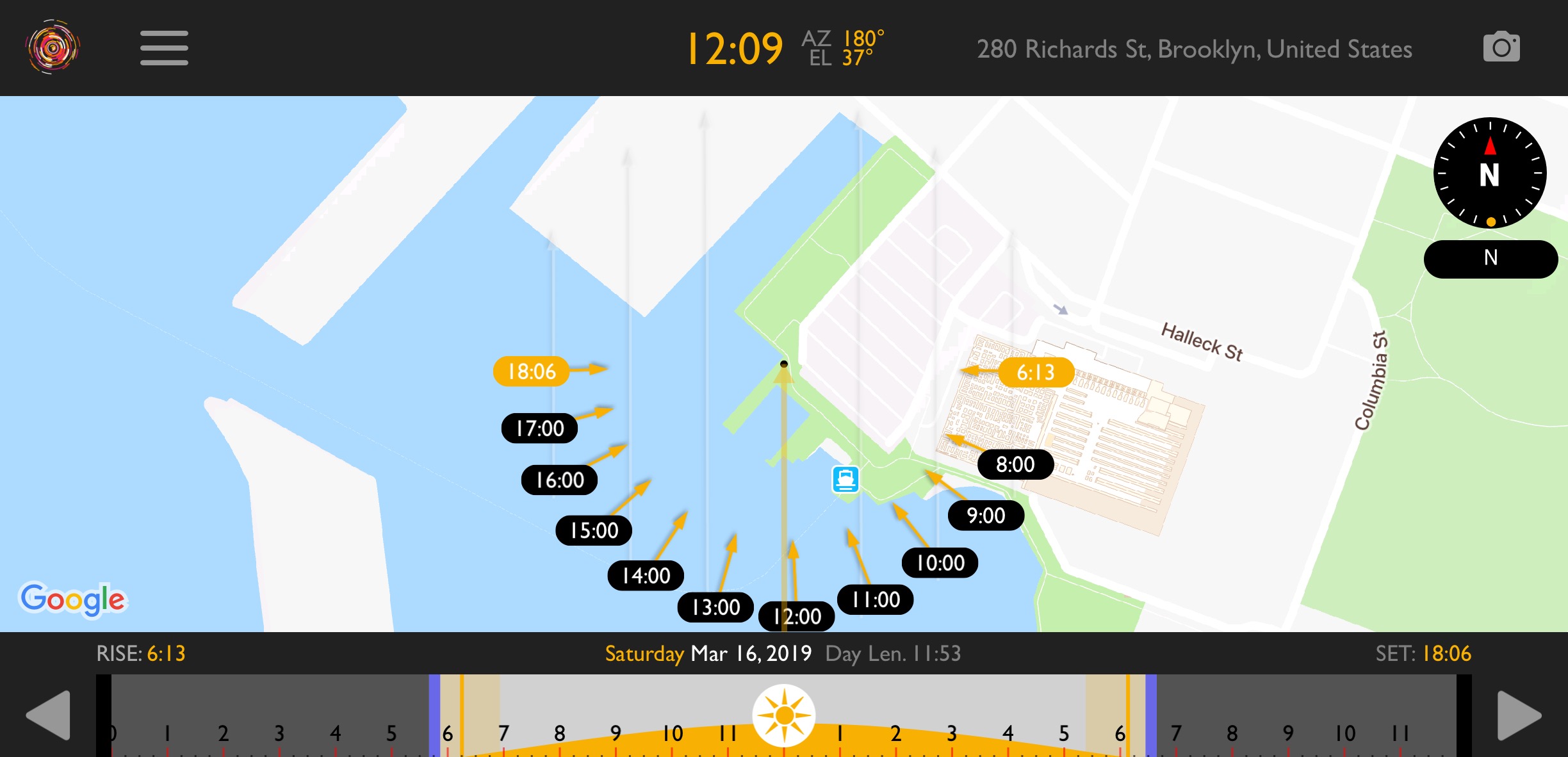
The key to using free locations to your advantage is to scout properly and schedule smartly. For daytime scenes, utilizing the sun to your advantage is a necessity. I use Helios Pro to track the path of the sun, and then I schedule the scene accordingly so that my subject is usually backlit, and that preferably the most important shots happen during golden hour. 

Use available light

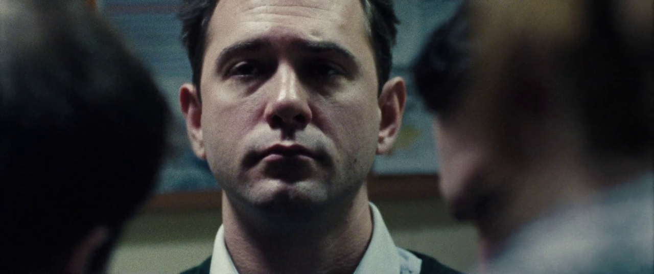
Just because you’re shooting a movie doesn’t mean you have to use movie lights. Depending on the story, a naturalistic look might be the best approach. When director Mimi Jeffries approached me to shoot a short film about mental illness, I wasn’t discouraged by the lack of resources. Instead, we embraced a look that we called “shaped reality”, and using whatever lighting existed in the space already, we would modify it to suit our needs.

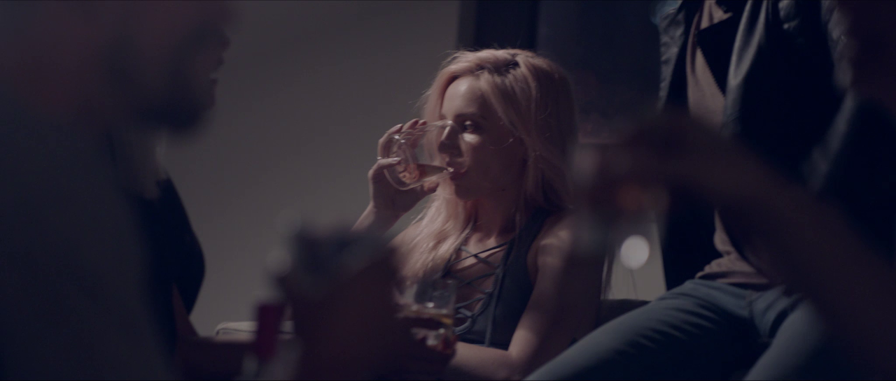
vlcsnap-2019-03-16-10h12m47s218.png

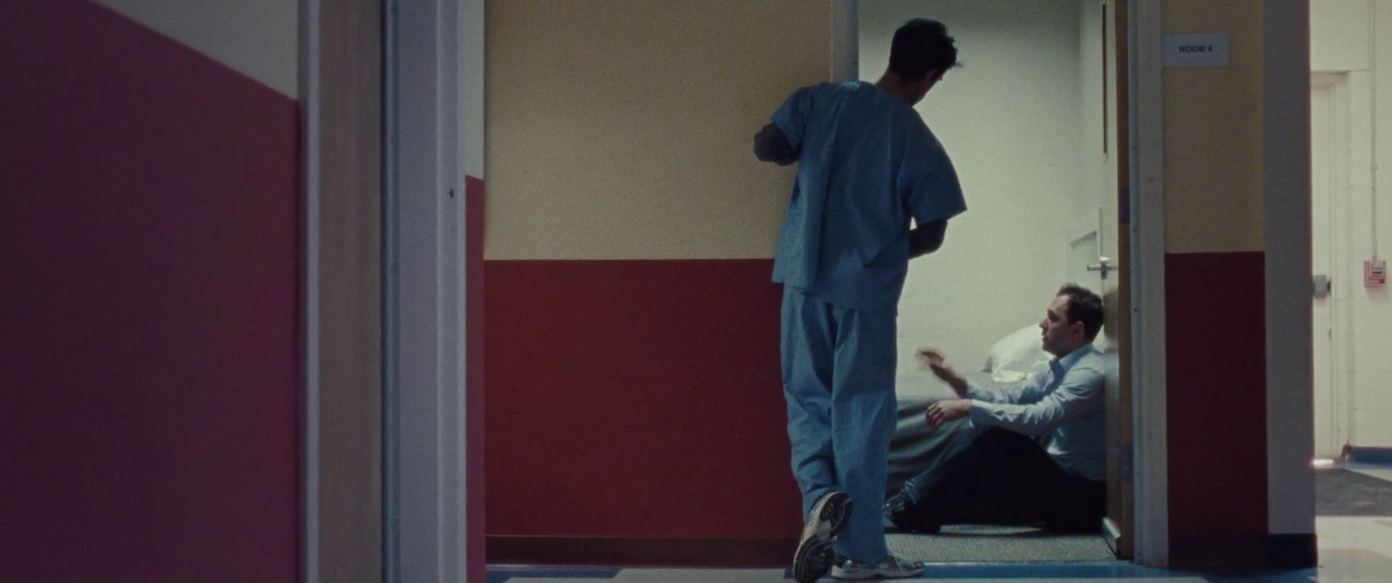
I worked closely with our two-man grip department in setting flags, hanging duvetyne, and otherwise sculpting light from the fixtures that were available to us. It didn’t always work perfectly, as you can see in this wide hallway shot where the duvetyne shadows are visible, but taken as a whole, the look reflected the grittiness of the story.

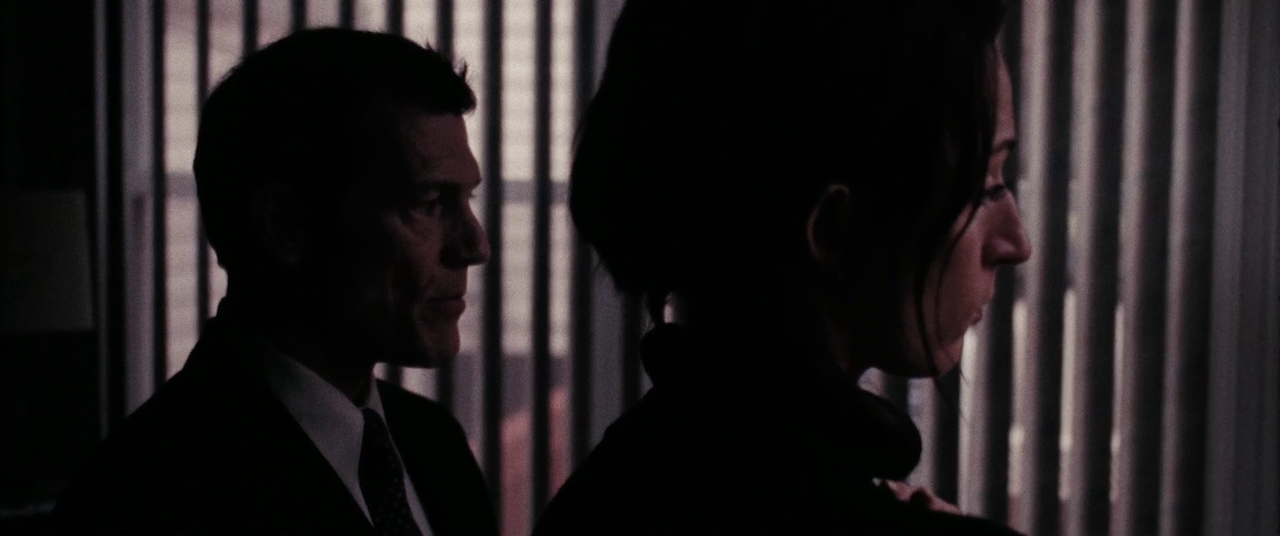
In two contrasting scenes, the boy’s aunt worries about our main character’s return and state of mind. For this, we added negative fill on the ceiling, as well as anywhere outside of frame, to create a dark sense of foreboding. On the other hand, for the escape to Disneyworld, we timed the drive so that the sun would pop in through the windows, creating a bright and warm look.

Adjust the creative

Just because you write a script starting with “EXT. NIGHT” doesn’t mean you can actually afford to do it. Night exteriors are notoriously expensive, slow moving, and generally an unpleasant experience without full control of everything. So when director Patrick Biesemans sent me the treatment for the “For Shelley” music video, I couldn’t help but feel nervous about how we would pull it off.

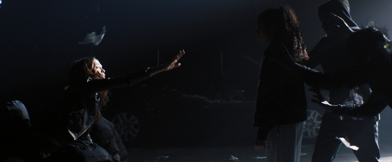
When working with a small budget, it’s important to trust your creative partners, and for them to trust you as well. When I make creative suggestions, it’s never because I am trying to impose my will or vision on the director - it is because I understand the limitations from a different perspective, and I want to make the final spot as good as possible. I suggested to Patrick to shoot in a warehouse space that we could dress with crew members’ cars to appear as if it was shot in a back alley at night. It fit the “nightmare world” aesthetic better, creating a surreal space for our chase scene to take place.

Patrick’s treatment called for vertical beams of light illuminating the girl and her mother, but after scouting the location we learned that they had a scissor lift available, and I suggested using moving lights to add a dynamic element to the video given the static nature of everything else. We lit everything with 3 JoLeko 800s with 10-degree barrels, and a single Skypanel to give us a dash of color.

What could have been a massive and expensive endeavor outside on a street became a much more efficient, and in my opinion, visually impressive piece that fit the story better. We were able to control the space, use atmosphere without needing a huge SFX crew, and light with a small G&E package, without being constrained by sunset and sunrise or needing to shoot overnight.

Use atmosphere

The single, most effective, and still my favorite way to light on a budget is to use atmosphere. Nothing gets you more bang for your buck, and I would rather cut every light on the truck before I get rid of the hazer. Haze adds volume and depth to the image. It adds fill via ambience instead of making shadows look unnatural. 

There are also other types of atmosphere that I love to use. Finely-chopped down feathers create a look of floating pollen which reacts beautifully to character’s movements or to fans and leaf-blowers. Wind creates an environmental element that can either mimic a character’s state of mind, or exaggerate their struggle. A bag of bio-snow, which depending on the size you purchase, can either look like snowfall or act like dust. A $100 bag will last you for days.

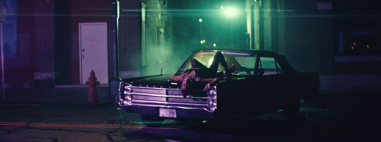
For the “Caught Up” video, the creative requirements lined up nicely with using atmosphere. We usually had a hazer running somewhere, even in exterior shots. The smoke in the alleyway is coming from a hazer hidden behind the car. What’s the motivation? Who cares, it looks great, and I bet you didn’t even notice before I pointed it out.

Director Floyd Russ even brought canned haze along, and we used it in the car for the scenes with our alien villain driving around, looking for her next victim. I still can’t believe it was mostly lit with a cheap Chauvet DJ light and a $20 RGB LED strip from Amazon. We did have a Skypanel and a Joker 400 for a couple of shots, but they didn’t play too often.

Every film can benefit from these rules: find great locations, use available light smartly, be flexible in your creative requirements, and utilize atmosphere. Whether you have $100 or $100 million, you can always fall back on these foundations to create beautiful images. Just remember that the number one purpose of a great image is to tell a great story.

As always, the conversation continues on my Instagram (@dkruta). Please feel free to send me any questions or comments. I love chatting about cinematography and I’m always interested to hear your thoughts.

The Life of a Cinematographer: A Prologue

I have to start this off by thanking everyone out there for the encouragement to bring back this blog. Staring at the last entry date of almost 5 years ago, the task seems overwhelming. The same questions run through my head that have for the last 5 years: “Why would anyone want to listen to me? What value does my experience hold for others? There are plenty of other cinematographers out there that are doing so much more, so what can I contribute?” I posted about it on my Instagram, wondering if anyone cared. Here’s how you answered:

IMG_4166.PNG
IMG_4167.PNG
IMG_4168.PNG

Aside from a few jokers (you know who you are), I have to say the response was overwhelming. So I’m going to dive in to this full force.

A recap

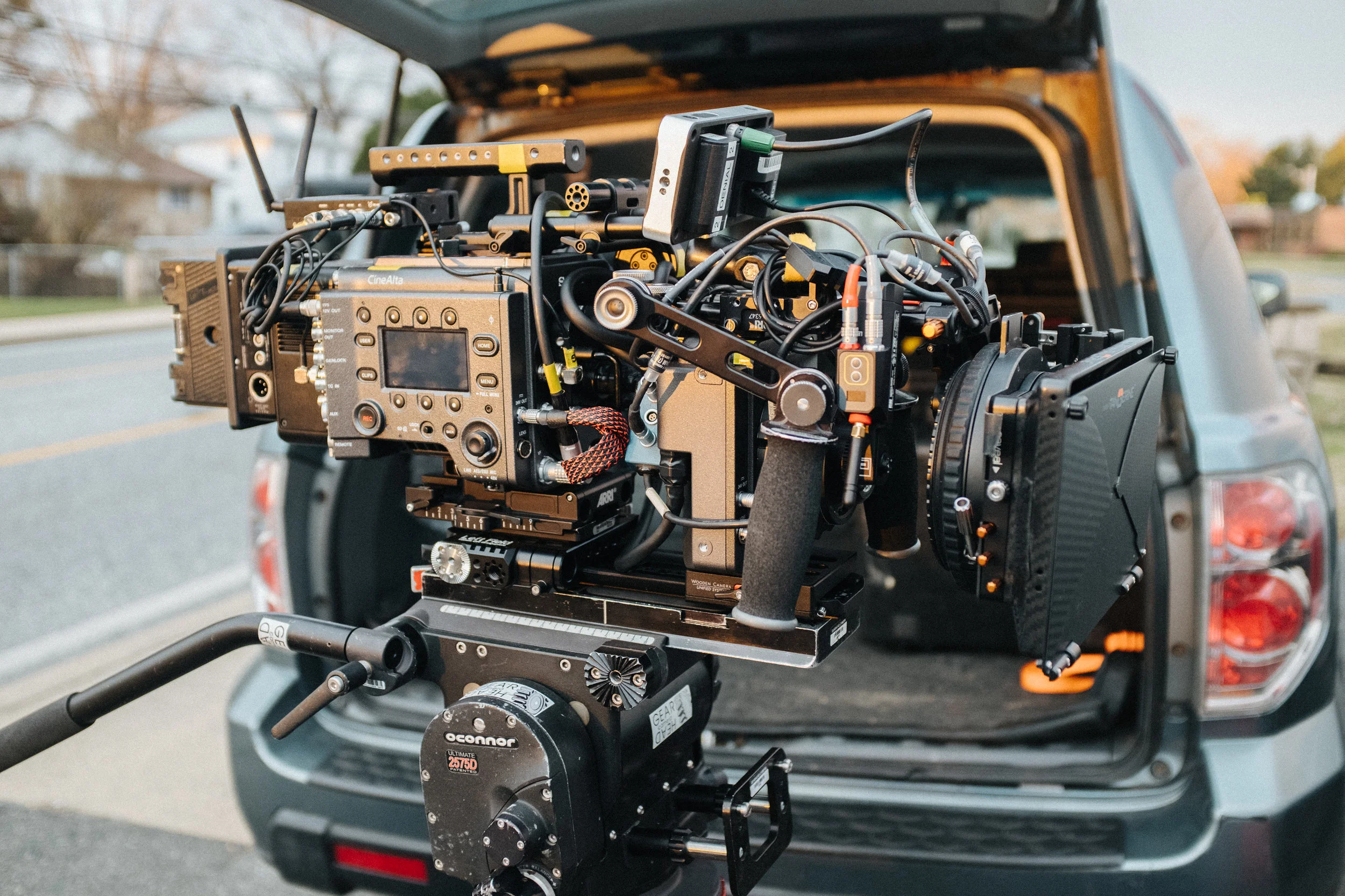
I started the year off shooting a short film with my longtime friend and collaborator, director Stuart Valberg (@stuartvalberg), and now new friend (and collaborator), producer Brandon Lescure (@brandonlescure). We shot a short film near Baltimore called “The Last Job”, on the Sony Venice and a prototype Rialto sensor extension unit, provided by Paul Healy (@sonysayspro) from Sony.

I’ll do an in-depth breakdown of the film, and hopefully I’ll be able to show you some really cool stuff we did that I can’t talk about just yet.

After we wrapped, I headed down to Mexico City for a week of vacation - my first in almost 2 years. It’s an incredible city, full of life, culture, great food, amazing people and inspiration.

I’ll be touching on work/life balance, and the importance of mental and physical health in future posts. This has become an ever-increasingly important topic for me. And yes, #everydayislegday.

DSCF1407.jpg

Working with friends and family unfortunately doesn’t happen frequently, but in this next project I got to do both.

Reunited with director Mike Pecci (@mikepecci), we shot my brother and chef Philip Kruta of Brassica Kitchen (@brassicakitchen) in a spot for a knife manufacturer. This was a pure collaboration on all parts, with another friend and collaborator, Patrick Biesemans (@patrickbiesemans), contributing the creative.

I’ll be doing a breakdown as well once the project is released.

Mike and I also sat down and recorded a podcast for In Love With the Process (@inlovewiththeprocesspod) about cinematography, DP and director relationships, our philosophies on filmmaking, and a few comments about beer and ribs - just some of our favorite topics.

The future

With that said, my goals for this blog are still coming in to focus. I want this to be a place where discussions can begin. I’ll be sharing my thoughts on the craft, updates and reviews of new equipment that I find interesting, technical breakdowns of how I light and shoot, the importance of networking, health, and other indirectly related activities, and hopefully some rib recipes.

I want to thank everyone that has so generously given their time, energy and knowledge over the years, and in bringing back this blog, I hope it can start to repay some of that debt.

I want to hear from you

As always, the conversation continues on my Instagram (@dkruta). Please feel free to send me any questions or comments. I love chatting about cinematography and I’m always interested to hear your thoughts.

Sidewalk Traffic, The Little Film with a Big Heart

Sidewalk Traffic centers around Declan Martin, a struggling filmmaker coming to terms with becoming a stay-at-home dad. Played by the gifted actor Johnny Hopkins, we see his day to day battle with the forces out of his control that intend to squash his dreams of becoming a director, all the while faced with responsibilities at home that he does not want to shirk.

Loosely based on the experiences of director Anthony Fisher, Sidewalk Traffic is at its heart a story about family, love and the American dream. Set in New York City, one cannot deny the juxtaposition - what once was the symbol of pursuit of dreams now serves as the backdrop to this poignant story.

As a cinematographer, I could not have asked for a better project with which to be involved. Under the open-minded guidance of Anthony, coupled with the guiding hand and logistical prowess of producer Robyn K Bennett, it was smooth sailing from the onset. We very quickly developed a language, leading to an incredibly smooth shot-listing process and the setting of visual rules, and rolled right into production with a plan that allowed both efficiency and inspiration.

One of the facets of cinematography that I think about most is the idea of perspective. Although we have a job of lighting and photographing performances and spaces, we have a responsibility to not just document, but to guide the audience where it is necessary. In our conversations about perspective, we wanted to feel like we were in the head of Declan. His character is constantly being rejected, and we wanted to make the world feel distant and disconnected. We wanted to feel like we were there with him along for the ride.

To achieve this very cerebral and personal feeling, I set out looking for the widest lenses possible. To me, perspective is overwhelmingly a lens choice - short focal lengths used for closeups distort the foreground, and make the background feel like it is a million miles away. The choices were narrowed down to Zeiss Ultra Primes and Cooke S4s, both of which have a comprehensive selection of wide lenses. I initially leaned towards the Zeiss lenses, because of the cooler color palette we were aiming for, and because there are a few more at the wider end: the 8R and 12mm, to name a couple. Unfortunately, we would need different matteboxes to employ the wider Zeisses, as they have much larger fronts than the longer lenses. This would have a butterfly effect on both our schedule and budget, so I elected to go with the Cooke S4s, choosing a 4-lens set composed of a 14mm, 18mm, 25mm and 32mm provided by Mike Nichols at Abel Cine. 

An interesting tidbit on depth of field and focal lengths - there seems to be a common misconception that wider lenses inherently have a deeper depth of field, and longer lenses are shallower. This makes sense until you consider that wide lenses are more often used for wide shots, where everything is in focus, and long lenses are often used for closeups, where the subject is the only thing in focus. When you match the field of view, the depth of field is equal (assuming all other factors, such as sensor size and T-stop) are equal. With this in mind, I often placed my camera mere inches from an actors face, and with a 14mm lens, you can see the world around them, but they are in a closeup shot.

I had the pleasure and privilege of working with a wonderful crew as well. Production Designer Muhammed Dagman, Costume Designer Saffuyah Fattin and Makeup Artist Guillherme Junquiera were excellent collaborators. From the start, we had an idea of a color palette emphasizing greens and purples, so Muhammed would put green and purple sheets on the bed, and Saffiyah would dress Dalia, Declan’s loving wife (played brilliantly by Erin Darke) in purple dresses and green shirts. Guilly and I would take a moment during downtime to test what certain lipsticks would look like on camera. Small examples of a greater effort, but the attention to detail is what made this movie what it is.
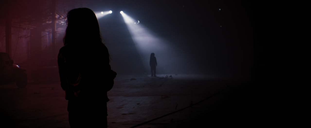
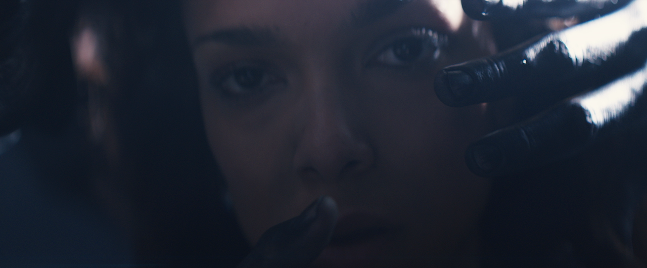
In addition, my long-time 2nd Assistant Camera, Jeff Clanet, stepped into the role of 1st AC for the first time on a feature. Anyone who has ever worked with me can say that I don’t like the use of marks and measuring for focus - I tolerate it. There is a beauty in shots that are technical and executed perfectly, but to me there is a greater beauty in the organic nature of feeling the actors perform and using the space to the betterment of the film. Since Sidewalk Traffic was entirely shot handheld, and with actors given rough notes for blocking, it was to both my surprise and delight when Jeff would nail focus on take after take, whether crammed in narrow hallways or running down a sidewalk. This film was so much about reacting to what the characters did that marks were not only impossible, but would ultimately become a burden. Jeff took this in stride and since has gone on to be 1st AC on a great deal of projects.
Coming from a DIT background, one of the most important aspects of capturing the image is not only to get optimal exposure for post, but also to create a look on set that will be carried through the edit and color grade. It’s extremely important for me that the director sees at all times as close to the final look possible that I intend for the piece. Having the luxury of a DIT on set that can grade in real-time and distribute close to final images to the monitors and dailies is incredible, but on indie films I have turned towards the use of in-camera LUTs to emulate what is, in essence, a modern-day film stock. We shot on the RED Epic, and I was able to go out and shoot a few test shots with one of our crew members in direct sun, overcast sky and nighttime scenarios. I pulled the footage into RedCine-X and built a basic look that boosted the greens in the midtones and purples in the shadows, along with a slight increase in overall contrast. Combined with the production and costume design, and serendipitous location choices, our imagery on set was met with pleased reactions, leading to renewed energy and inspiration for the following days.

I was not able to do a proper DI test prior to the film, but having shot on Epic so many times before, I’ve learned that a small amount of underexposure, along with taking extra care to protect highlights in certain situations, leads to wonderfully dense images that are full of life. My base exposure hovered around ½ to 1 stop under, which in my opinion, brings skintones to life and creates deep, rich blacks. As long as you’re not pushing the image, it takes on a filmic quality, and although digital has yet to rival film, it is becoming quite close.

We lit with a very small G&E package, which consisted of a Spider-light, a softbox in which sit 6 100 watt Edison soft-frost bulbs, an Arri 150 watt Fresnel, and a small complement of solids and diffusion. The entirety of our daylight scenes were shot with available light, slightly modified, and our night scenes consisted of the Spider, Pepper and a couple of 150 watt bare bulbs. The only scene with additional lighting was our nighttime exterior, where Declan shares a moment with his neighbor, in which we used a 1k Open Face to mimic a street lamp. With no gels to work with, the sodium-vapor look was achieved in post.

For the final grade, we worked with Colorist Andrew Francis with Sixteen19. We were incredibly lucky to grade on their Davinci Resolve system in front of a 60’ screen at Steiner Studios. I owe the final look of this film to Andrew and the wonderful folks at Sixteen19, who made the experience smooth and pleasant. Andrew took my ideas and turned them into a film that exceeded my expectations. Andrew comes from a telecine background, but quickly adopted RGB offset corrections for feature film to maintain a more filmic approach.. Due to deadlines, our DI took place in 4 days, a rapid pace for a feature film, and it turned out looking stunning. He also happens to be a kind and inspiring person and I, and with this film, were lucky to have his contribution.

Indie film is alive and well, and this is a project that proves it. I am incredibly grateful to everyone that participated and contributed in making this the little movie that could.

Sidewalk Traffic premieres at 9pm, Wednesday, June 18, 2014 at Sunshine Cinema, 143 E Houston St, New York, NY, 10002. For more info and tickets, please visit the following link:
http://www.lesfilmfestival.com/schedule/2014/6/18/tough-love-night-9pm-feature-sidewalk-traffic#

Keep up to date with Sidewalk Traffic at sidewalktrafficmovie.com